Last June, I showed a house in Rosemary Beach, Florida that interior designer Jenny Johnston had totally remodeled. Jenny took the beach house from the 1990s to the 2010s by using cooler colors, white slipcovers, antiques and trendy fabrics and furniture. Most people who left comments loved the transformation, but a few did prefer the older décor more: the brighter colors, the pine furniture, and the bold printed upholstery fabrics. Recently, Jenny showed me pictures of a condominium in ski country – Crested Butte, Colorado - that she had remodeled. The redo took two years to complete and it was a total gut job – with a new kitchen, bathrooms, lighting, flooring, etc. – everything was redone. I think I can safely guarantee that no one will say they like the previous décor better! The condo is very small – 2 bedrooms and one loft bedroom with just one living area. The “Before” pictures show that the condo hadn’t been freshened up in over 20 years, while the “After” pictures show Jenny’s dramatic transformation. The décor is very Colorado ski country chic – rustic, yet sophisticated. Enjoy!!!
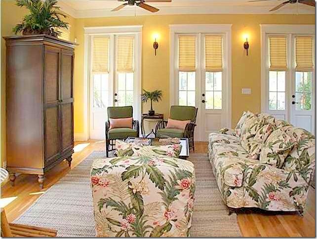
Rosemary Beach, Florida: the “BEFORE” living room. Some commenters preferred the 90s décor over the new look. Most though, liked Jenny’s updated décor more. Me too!
AFTER: A white slipcover sectional is much quieter than the loud island printed fabric of before. Jenny painted the yellow walls white and brought in an antique French buffet and a trendy Belgian styled coffee table. To read the entire post on the Rosemary Beach house, go HERE.
CRESTED BUTTE, COLORADO CONDOMINIUM:
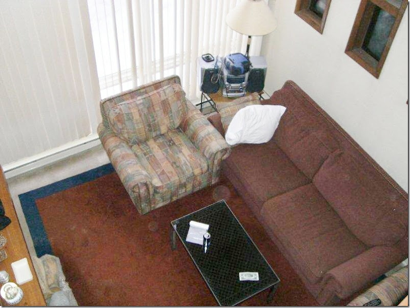
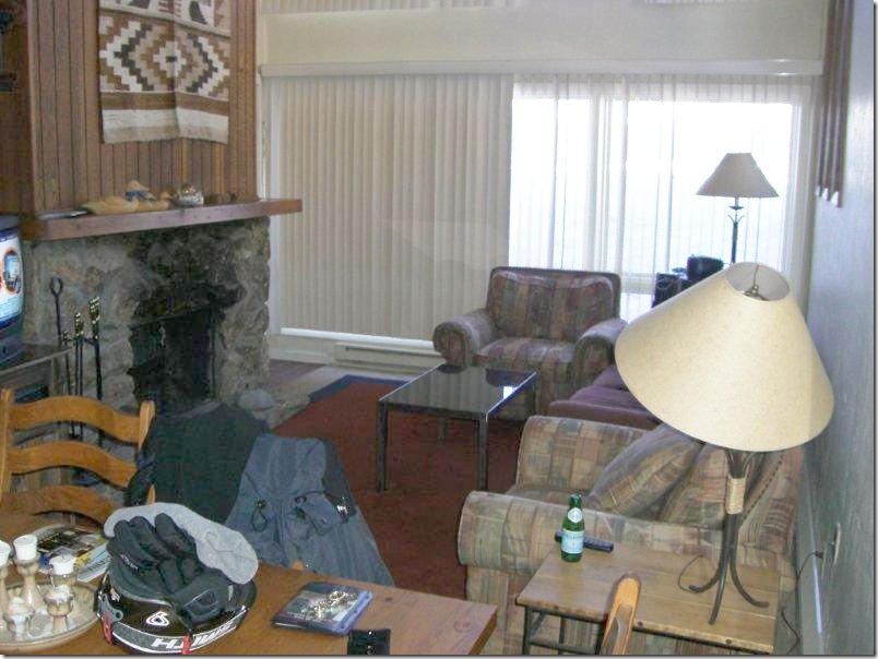
BEFORE: Typical Colorado ski country condo – rock and wood fireplace, vertical blinds, bulky furniture in maroons, blues, and greens.
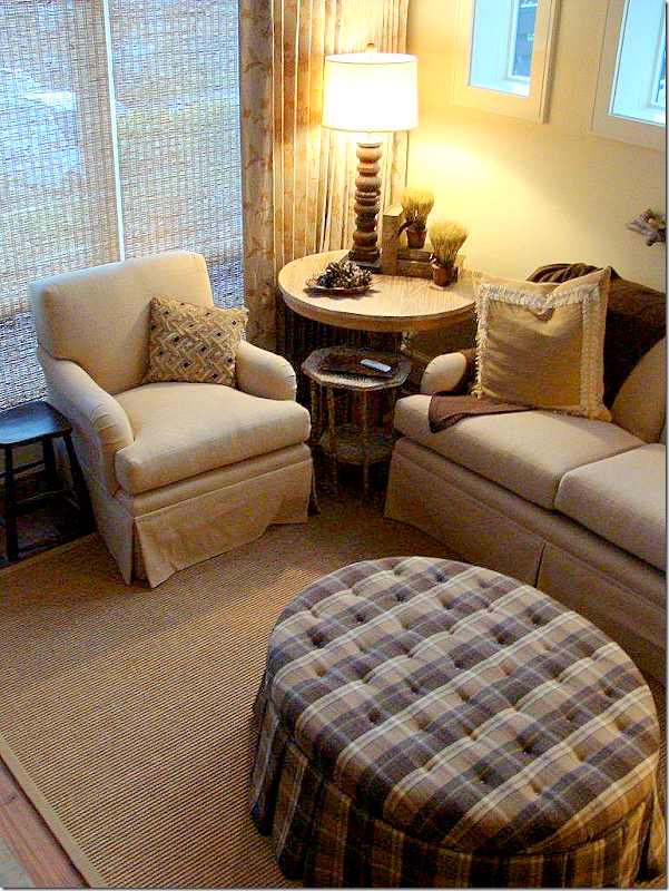
AFTER: Everything has been gutted and changed – soft, printed linen curtains and textured blinds replace the verticals. The furniture is in shades of cream and ivory, with a large tufted plaid ottoman. A textured rug covers the living area.
BEFORE: The wood and rock fireplace as it was before Jenny redid it.
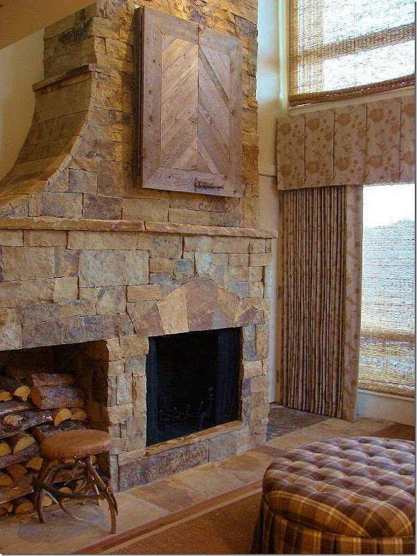
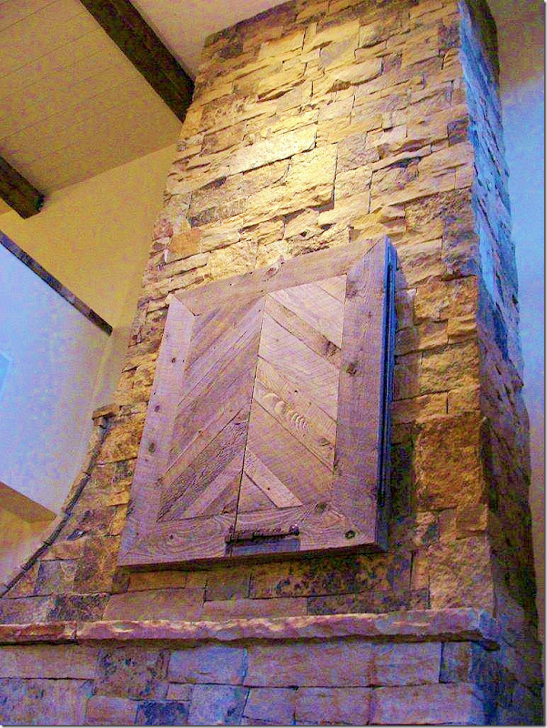
AFTER: The new slate fireplace has a wonderful curve on its left side, leading to the loft floor above it. A new cubby holds all the logs. Notice the way Jenny handled the flatscreen TV – a nice alternative.
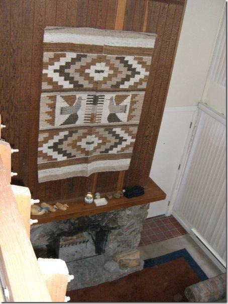
Before: Wood and stone fireplace. You can see the front door to the right of the fireplace.
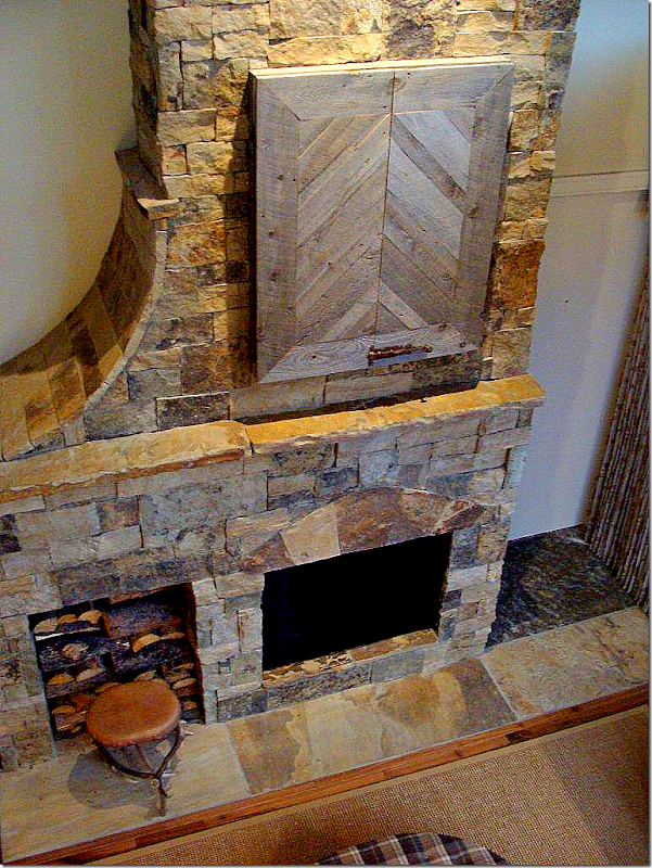
AFTER: Looking down from the loft at the fireplace – you can really see the curve on the left side and the large hearth on the right, which serves as a small entry hall. The front door to the condo is directly to the right of the fireplace.
The living area is very small, so furniture is kept to a minimum. The ottoman does double duty –it’s perfect for a coffee table AND extra seating.
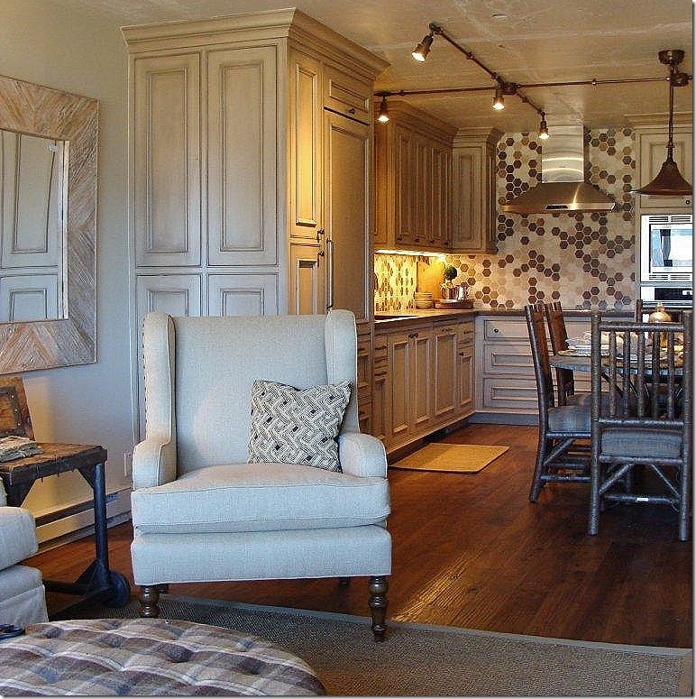
AFTER: Looking the other way towards the kitchen area. Notice the great woodwork in the kitchen – the refrigerator is almost invisible in the paneling.
BEFORE: Here you can see the kitchen and living/dining area – once two separate rooms. Jenny removed the wall between the two spaces, opening it up to create one larger, open room.
AFTER: Same View. The kitchen and dining area are now one big space, combining it with the living room. The floors were replaced with rustic looking hardwoods – keeping with the ski lodge atmosphere.
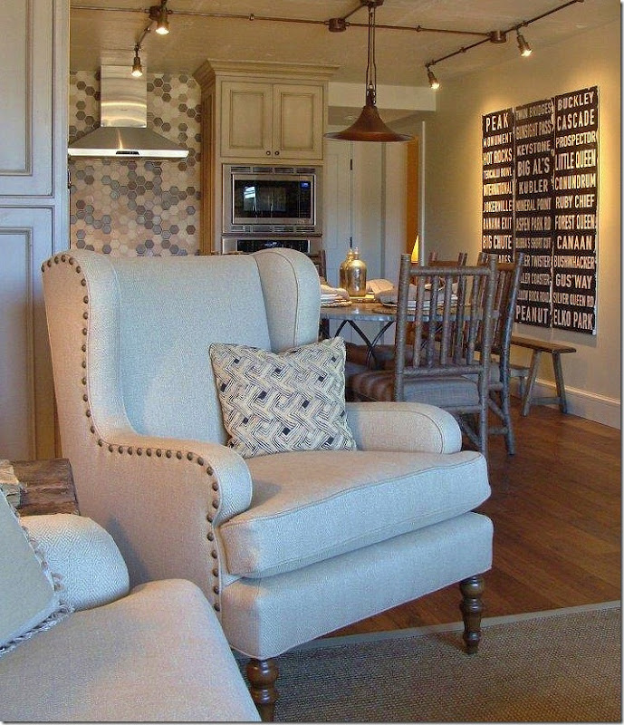
AFTER: Trendy nailhead armchair in the living room and an even trendier railway stops sign hangs in the kitchen area.
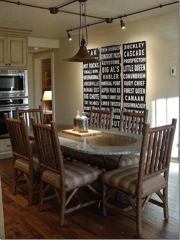
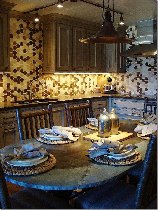
AFTER: The dining room chairs have a log appearance, again – keeping with the Colorado vibe. Great tin top table with curved iron base. Notice the overhead lights and fixture. Through the back hall, you can peek into the kids bunk room.
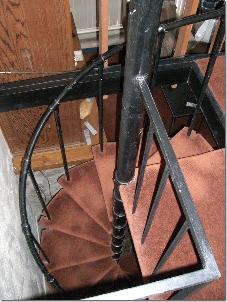
BEFORE: The spiral stairs with the brown carpeting that leads to the loft area overlooking the living room.
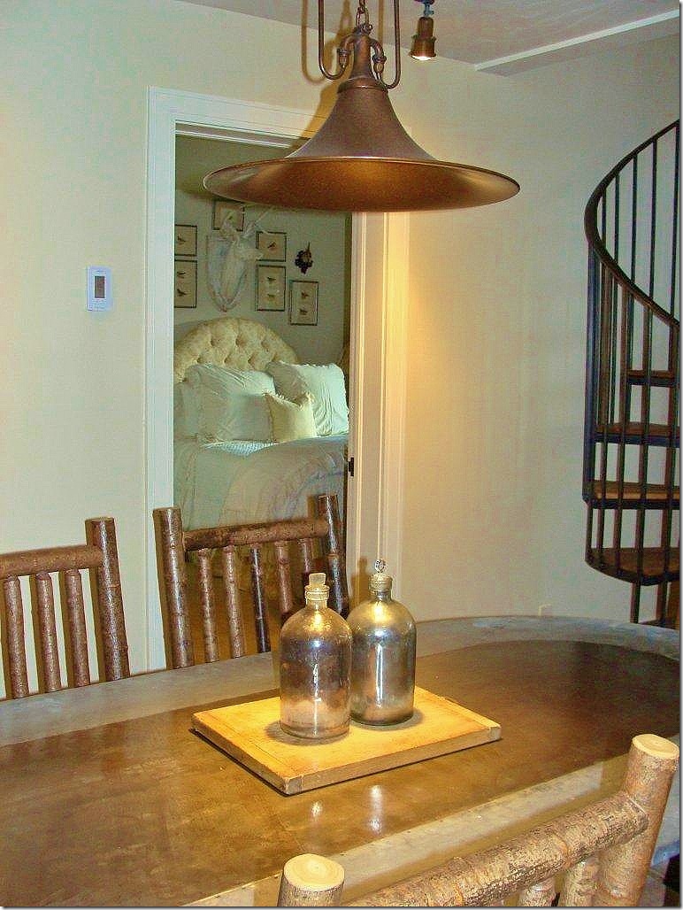
AFTER: On the spiral stairs, the carpet has been replaced with wood. Here, you can see into the guest bedroom. Notice how the table looks bronze in the center – which goes with the metals in the kitchen. And the chairs – really do resemble cut logs – perfect for ski country rustic!
AFTER: Looking at the other side, the range has a cute hood and hexagon tiles in shades of bronze, taupe, browns and ivory make a huge style statement.
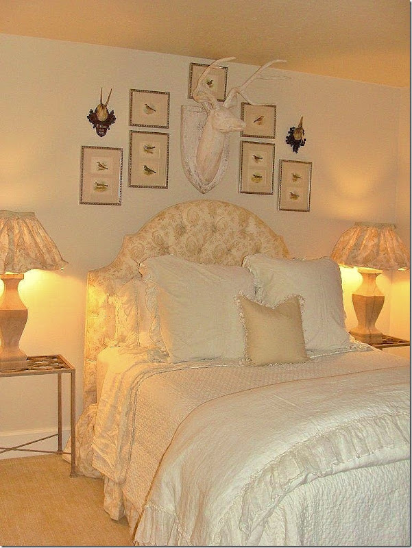
AFTER: The guest room, off the dining area, has textured wall to wall carpet.
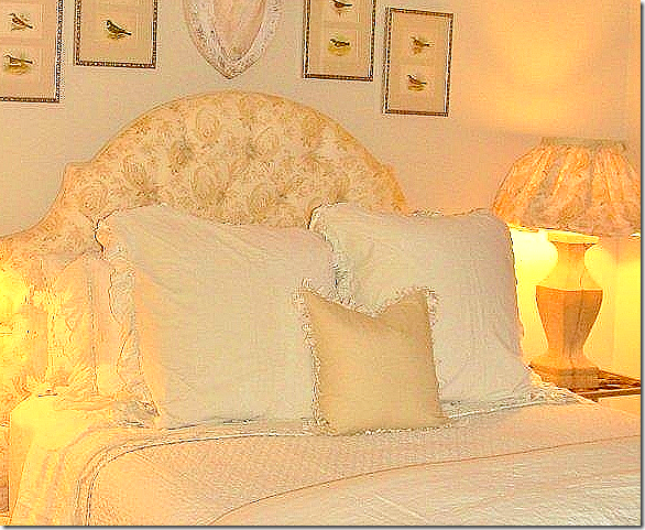
I adore the lampshade treatment!!!
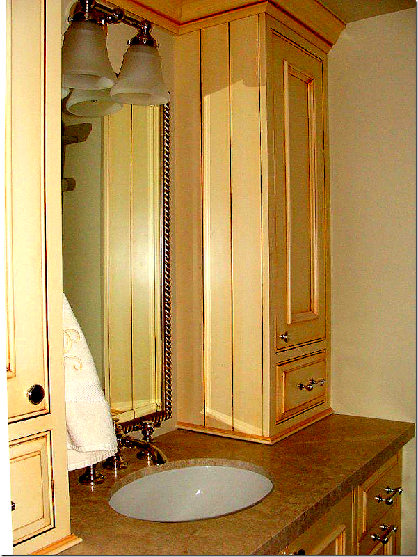
AFTERL: The guest room’s bath. Jenny used the same cabinetry here as in the kitchen, and throughout the condo. In such a small space, the repetition of the cabinetry and other design elements creates cohesion.
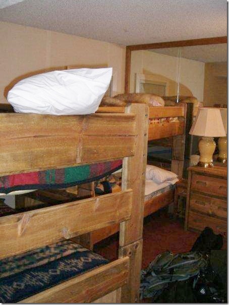
BEFORE: The jumbled and cramped kids bunk room.
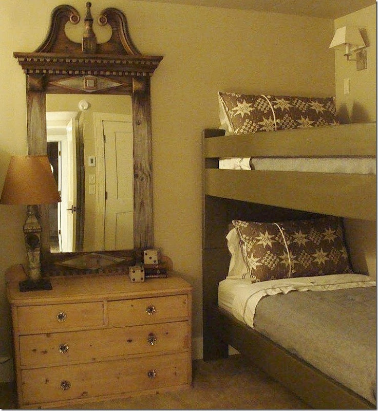
AFTER: The bunk room now has two sets of bunk beds in it. An antique pine dresser sits between the beds. The tall mirror is an unexpected touch of elegance – juxtaposed with the rustic dresser. Bunk beds remained – just with a new, deeper paint job.
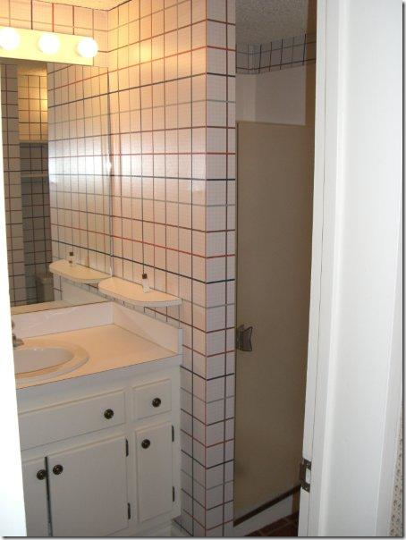
BEFORE: The bunk room’s bathroom is small, with room for just a shower stall. What could possibly be done to this space to make it interesting?
Ask Jenny!
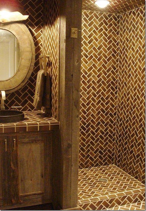
AFTER: WOW! The bronze colored tiles fit well with the bronze tiles in the adjacent kitchen. The shower is open to the room, thus making it seem somewhat larger. The patterns of the tiles creates an additional design element. The cabinetry and paneling is a rough wood. Just wonderful!
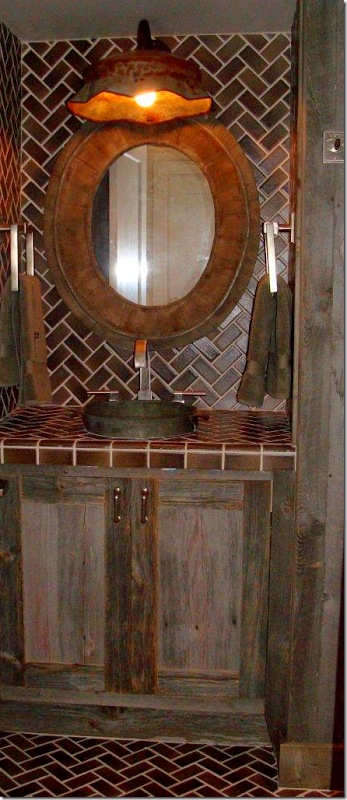
AFTER: Close up of the rough wood cabinetry and notice the hanging light fixture.
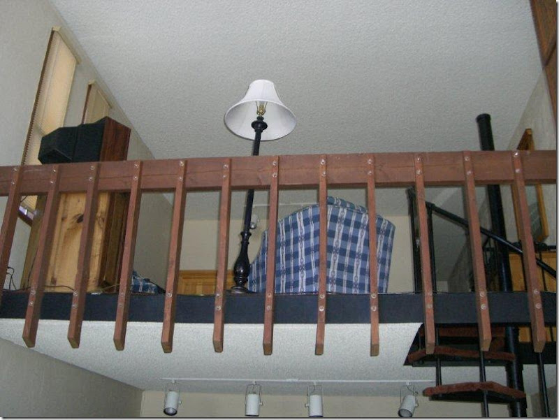
BEFORE: Above the kitchen/dining area is a loft room and bathroom. Previously this area was open to the living area with a dated wood railing.
AFTER: In this picture – to the left of the fireplace - you can see what Jenny replaced the wood railing with. Instead of an open rail, she put in a half-sheetrock wall, providing a bit more privacy to the loft area, which is used as a master bedroom. The top of the wall is finished with a piece of stained wood and there are stained rafters that Jenny added to the condo. Notice, here too – the rustic latch used on the TV cover. For such a small space – there is a lot of detailing that was put into it – all adding up to a more interesting scheme.
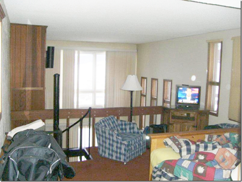
BEFORE: Upstairs overlooking the living room below. You can see the wood fireplace mantel at the very left.
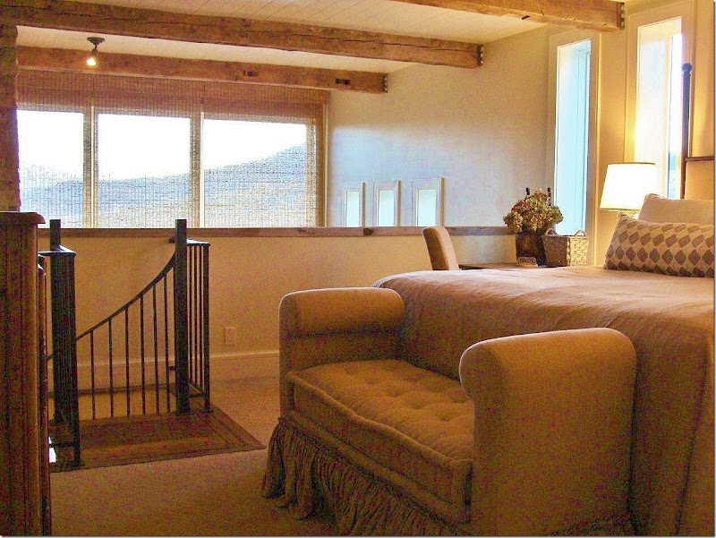
AFTER: The loft area is now the master bedroom – with the beautiful view outside the tall windows. The railing is now a half wall providing a bit more privacy, while updating the look. At the foot of the bed is a tufted bench with double ruffling. So pretty! Jenny installed the rafters which add to the rustic look. And between the rafters is beadboard, just another detail that adds to the charm.
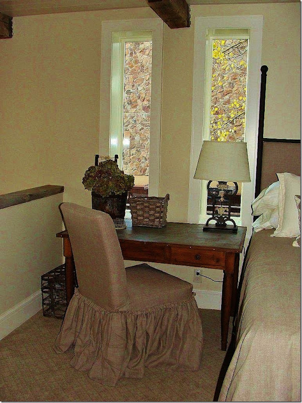
AFTER: A slipcovered chair with similar flange edged, double ruffling sits next to a desk and the bed. The odd shaped windows which can’t be changed out, once had dark stained molding surrounding them. By painting the molding white – the windows tend to disappear in the background. The carpet here is a tone on tone flat pattern.
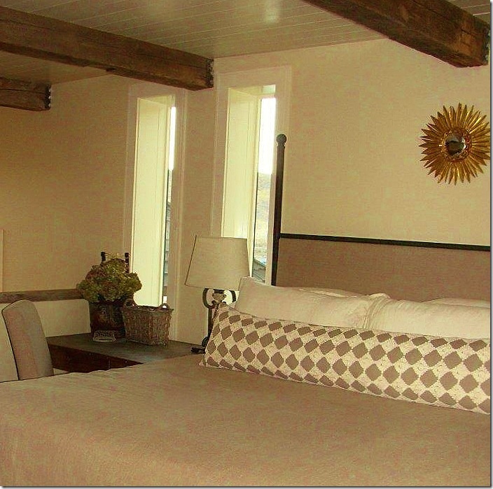
AFTER: Across the bed, one long lumbar pillow adds the only pattern in the quiet room.
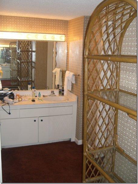
BEFORE: The master bathroom is a mess, outdated and ready for a complete overhaul.
AFTER: Using the same beautiful cabinetry as the kitchen and guest bathroom, Jenny put in a double vanity with a lowered makeup area in between.
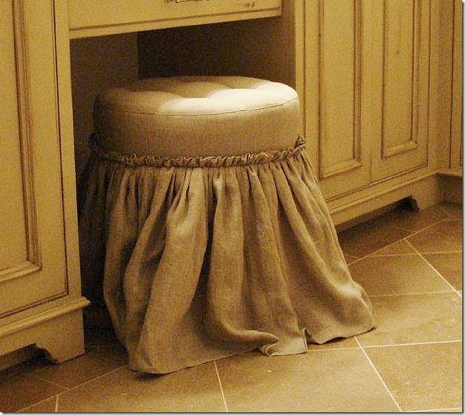
AFTER: The tufted stool is done in the same master bedroom linen with the same flanged edge double ruffle detailing on the skirt.
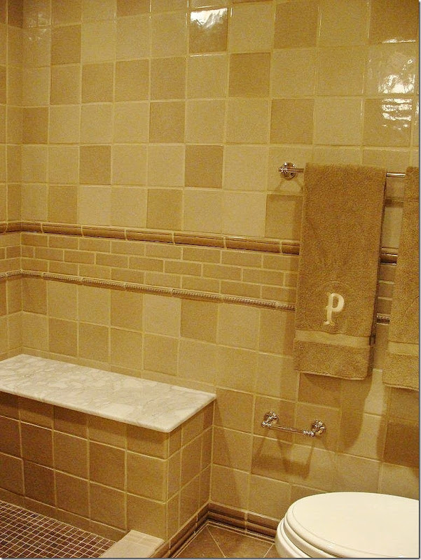
AFTER: The tiles are mixed with white marble in the bathroom. Since this is part of the master bedroom suite, the tiles and tile patterns are sophisticated and quietly elegant.
I hope you have enjoyed seeing how a dated and unattractive condominium can be updated for the new decade. Despite its small size, the space reads large and functional, with a rustic Colorado ski lodge atmosphere that is sophisticated at the same time. Thanks Jenny for sharing this!! It’s beautiful!
Interior Designer Jenny Johnston can be reached HERE.
NOTE: Don’t forget there is a new Skirted Roundtable interview up with Meg Fairfax Fielding of Pigtown Design. Next week – David Easton will be our guest! Listen HERE.
