“La Quinta” – the proper name of the California Dream House #1.
The California Dream House #1 sparked some reader interest. One commenter hinted this house was owned by a celebrity. Another said Diandra Douglas owned it. One eagle eyed reader from Houston emailed me also saying this was Diandra Douglas’ house – the one she lived in before and after her marriage to actor Michael Douglas. “Oh no, it’s not” I quickly emailed her back. “I’ve seen those pictures – it DOES look similar but it’s not hers.” Talk about being a big-mouthed know-it-all (which is exactly why I started a blog, I suppose.) But it nagged at me. Was it really hers? Earlier this year, author and blogger Diane Dorrans Saeks came out with her latest book “Santa Barbara Living” – which featured La Quinta. I hadn’t looked at the book in months - perhaps I needed to? In my defense I will say this – the previous pictures I had seen of La Quinta featured rooms that looked different and much smaller, too. But comparing the photos from the Saeks book and a newly found real estate brochure – I must admit, I was wrong. My dream house and La Quinta are, of course, one and the same.
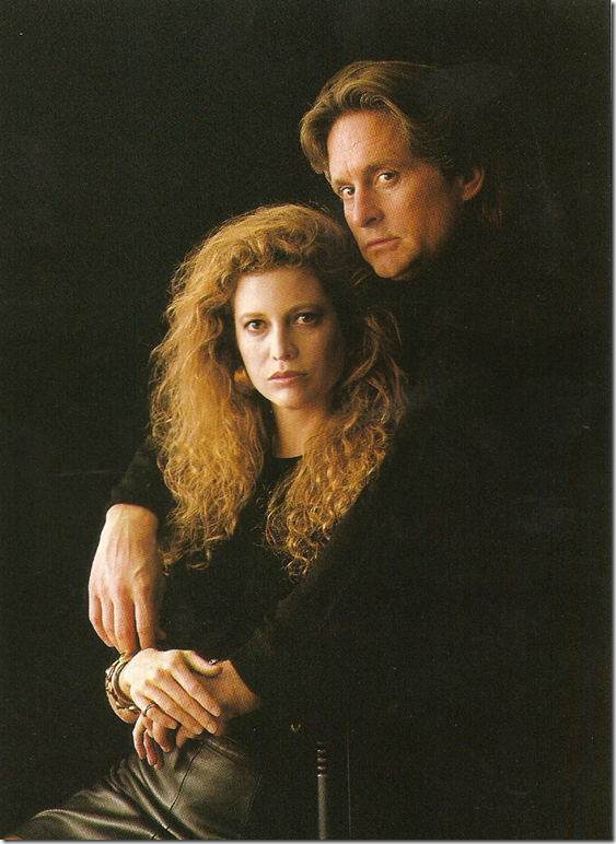 Featured a decade ago in the French Architectural Digest – Diandra and Michael Douglas during happier times at La Quinta.
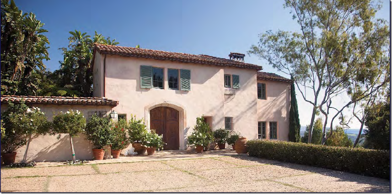
The massive double doors that lead into the Montecito house. Though I wrote these doors were probably original to the house – they aren’t. Diandra replaced those with these antique Castilian carriage doors.
I originally wrote:
The main living room was a surprise. It actually looks like it was decorated by someone young for someone young. Most houses in this price range are furnished rather theme-like and matronly, either heavily Tuscan-inspired with lots of chenille or sappy French with frothy silks and brocades. This house looks like it was designed by someone who might occasionally look at a trendy magazine or two. And it looks extremely livable, warm and inviting. Though very large – I can imagine watching TV in here after dinner with Mr. Slipper Socks Man. This room is not dressy, it is relaxed and comfortable – perfect for a young family with lots of children. Do you have any idea what a house like this might cost?
Knowing now that the house belongs to Douglas, a woman of impeccable taste, I laugh at my words “decorated by someone young for someone young.” Well, Douglas is close to my age, but she has no young children – only a grown son. Also, the house and this room in particular was decorated differently at first. The decor was somewhat dressier with silk covered sofas – until Douglas decided to bring in the white slipcovers and take it all down a notch. Architectural Digest’s Top 100 Interior Designers, the noted antiquarian Craig Wright, helped Diandra with the decorating – but he only helped. The vision was Diandra’s. La Quinta was the first house that Diandra and Michael saw in Montecito and the put in their bid for it immediately. They spent two years refurbishing it all – only the living room and dining room remained structurally the same. Wright, owner of Quatrain, recently sold his possessions at a Sotheby’s auction and a large portion of the sale included pieces owned by Diandra. Perhaps they were from other decorating schemes at La Quinta?
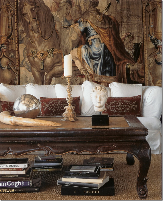
This photograph comes from Saeks book. The sofa, on the right wall, sits underneath a gorgeous 18th century tapestry. Though I had this image saved in my files, I didn’t realize this was the same house - I had always thought the rooms pictured in Santa Barbara Living were much smaller. This table is seen in the photograph from the real estate brochure. Notice how wonderful the pillows pick up the colors in the tapestry – Diandra does have fabulous taste and style. I love the accessorizing on the tabletop. And this also shows how much more beautiful professionally shot photographs are! These photos seen in Santa Barbara Living were taken by Lisa Romerein.
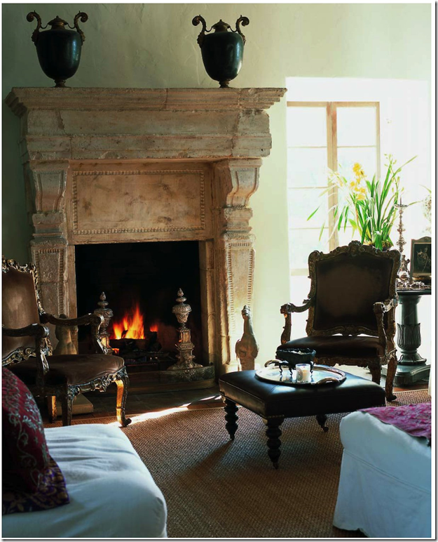
Another picture from Saeks book of the same living room. Do you see why I thought the room was smaller? Notice that the window is not black. Also notice the seagrass in the book’s photographs are the typical weave. Today, this rug has been replaced with a diamond patterned seagrass with a dark, wide border. The ottoman is also different here – it looks like it has been replaced today with Oly Studio’s zebra ottoman. Gorgeous andirons – just gorgeous!
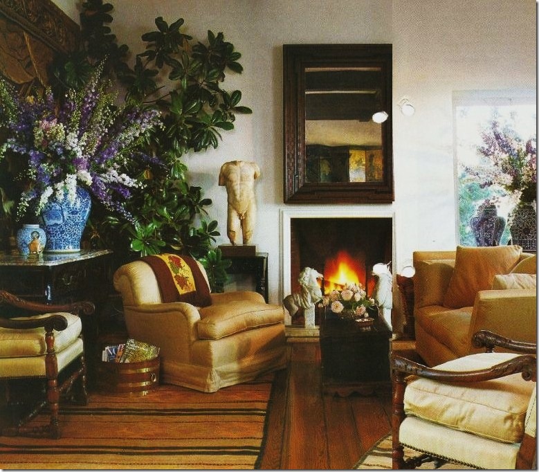
The Houston reader who first alerted me to the origins of this house once lived in France and had saved the story of “La Quinta” from the French Architectural Digest. Quite organized, the Houston reader neatly places her clippings in plastic sleeves that go into a large binder, hence the page holes in these pictures. This story was published about a decade ago – and notice what a huge difference the decorating is here compared to today. This is the living room – notice the windows are painted white here. The floor is covered with several small striped dhurries and much blue and white porcelain is placed about. The mantel is missing, today there is a large antique limestone mantel here. The furniture is also totally different. No pieces here are seen today. On the left is the 18th century tapestry that is still used in the living room. In the mirror you can just barely see a large oriental screen along the right wall. Diandra says that when she first moved in, the decor was very dressy with lots of silks and she has since made the house more casual. This room might not be the original decor – it doesn’t seem too dressy, but it may be. I must say I love the decor here and as it is today. Do you have a preference? I actually like them both!
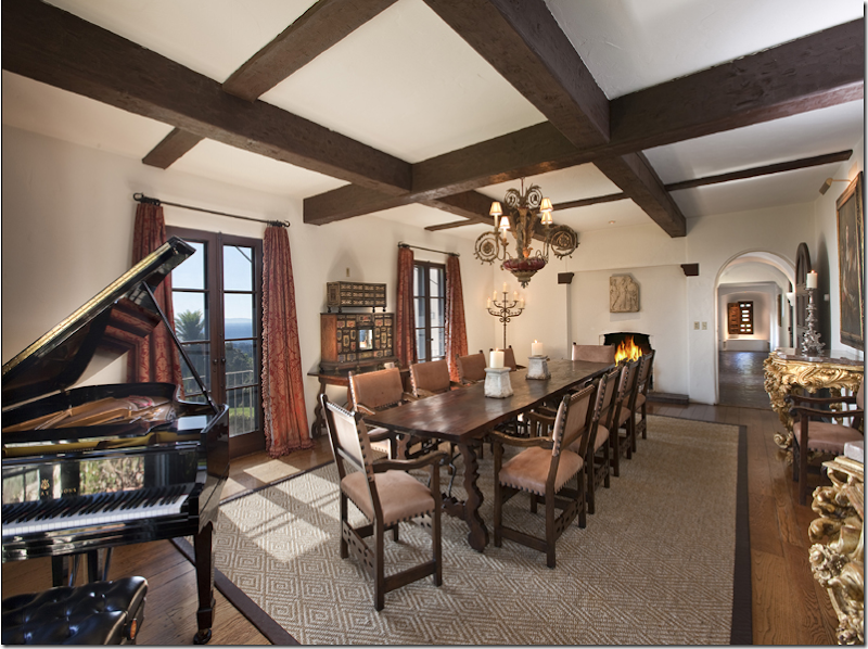
In the dining room – I didn’t care for the chair fabric or the chandelier. But of course, it’s another story when I see the professional pictures!
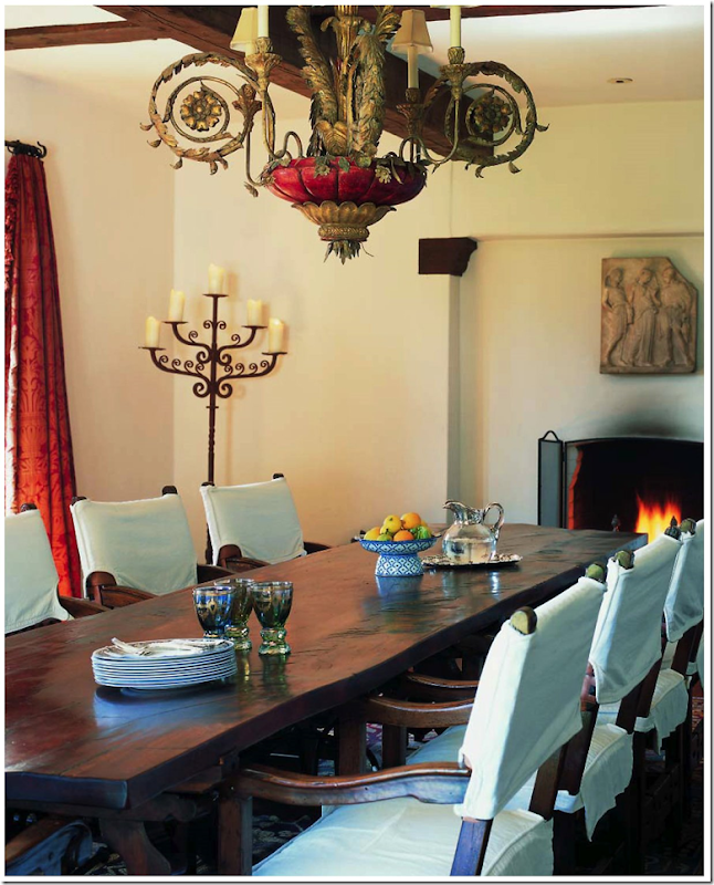
In this beautiful photograph from Saeks book, the chairs wear white slips, which I prefer, and the red tole chandelier from Quatrain is simply stunning. The red chandelier ties in with the red curtains – and makes more sense. You can just make out a damask like pattern in the fabric. In this photograph, you can also make out the relief seen above the fireplace. An oriental rug is underfoot as opposed to the seagrass. Again, this tight shot of the room makes it seem much smaller than it truly is. This room looks nothing like the real estate photo, another reason I missed the fact that this was La Quinta.
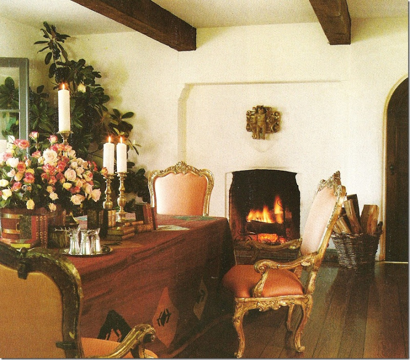
And, a decade before – a dhurrie rug covers the table, while gilt Venetian chairs surround it. The chairs, here with a peach silk fabric, are the same ones, now wearing a raisin colored silk velvet fabric, that are seen in the living room and in the gallery adjoining this room. There is no rug underneath and the beautiful floor is prominent here. A long gone santos takes the place of the relief. Of the three versions of this room – which do you prefer? I think I like this and the white slipcovered chair versions best!
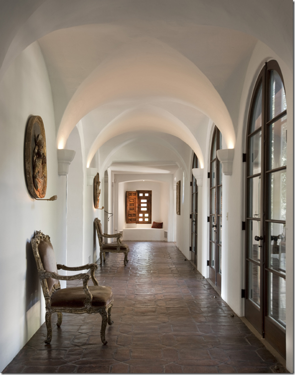
The gallery off the dining room. Here you can see the chairs that once sat around the dining room table.
The only photograph of the kitchen comes from the real estate brochure. The butlers pantry with its original wooden countertops is through the door along with the back staircase. This all leads to a guest apartment – with its own kitchen – that adjoins the two staff bedrooms – making a total of seven bedrooms in the house.
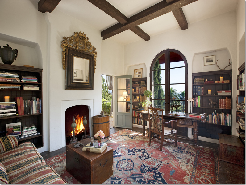
The library – as it looks today. The beautiful mirror above the fireplace shows up in another room in the Architectural Digest pictures.
The library – a decade ago! Here you can see the beautiful tiled floor. I’m not sure if this is the original floor or if this is what Diandra replaced – either way, its fabulous. The desk is still in use in today’s library, but the tapestry chairs are long gone, as is the ornate stool. The scalloped awning is no longer in use, nor are the curtains – notice the puddle, so 90s!!!!! And finally – the window has been replaced with French doors that open. Here is appears it was a plate glass. Not sure which version I prefer, maybe a bit of both.
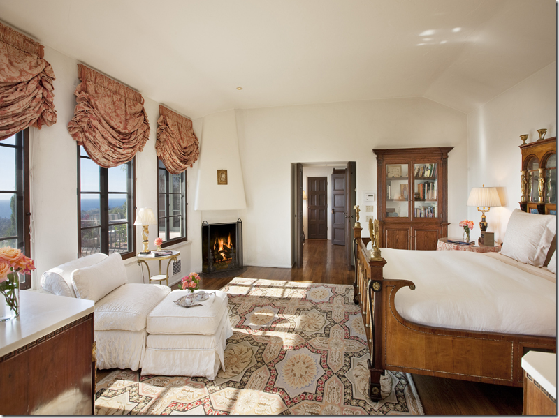 The master bedroom as it is today. Light and bright with pretty blinds. There is a large entry hall to the master suite, along with a sitting room and two bathrooms – his and hers.
A decade earlier, the master bedroom is visually linked to the decor of the rest of the house with its browns, golds, and persimmons. The beautiful Spanish baroque mirror – now in the library - looks so wonderful here – above a great antique gateleg table that is no longer around. Notice the legs on the gateleg. The bed is a marquetry Dutch colonial and the cane chaise longue is 19th century English. Wow – I love this older version of the master bedroom! The bed looks so fabulous!
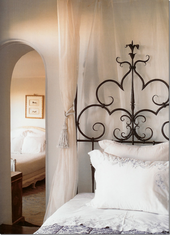
The guest room - off the large balcony– as it is today.
The beautiful picture of the guest room from the Diane Dorrans Saeks book. Here you can see this room adjoins another guest room, an interesting arrangement.
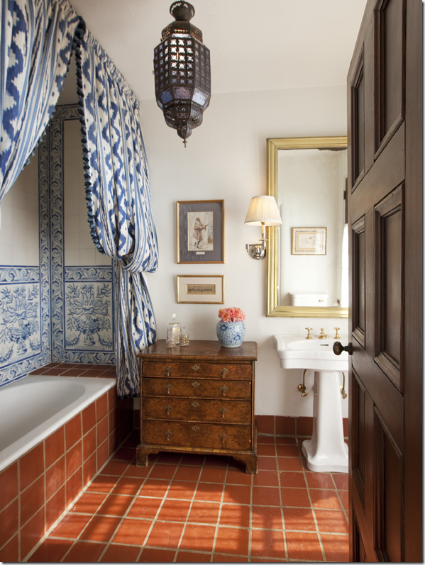
The guest bathroom – all the Portuguese tile is original to the house.
![[sb.court.bathdd.jpg]](https://blogger.googleusercontent.com/img/b/R29vZ2xl/AVvXsEgrY1RqXmZldPWm7iwOM5wKdRR_Gsb-7kYKFnzBdizLWYurzOp8Hzy-SFRqFawtES6SzCFot7EMMQcZaPkZJsTs4kAwlKqoie1wtQvFWjcdMY33nTpkvesHVKivmMjAUAwJXkHuiD0NHVHs/s1600/sb.court.bathdd.jpg)
And again from the Saeks book. Even the lamp and bottom painting had to be changed. Nothing seems to stay the same for long around La Quinta. But, in the real estate picture of the bathroom above – you can see that they moved the painting from above the chest to be reflected in the mirror – this is called photostyling. Which picture of the bathroom do you think is better stylistically – this one or the other?
The beautiful loggia.
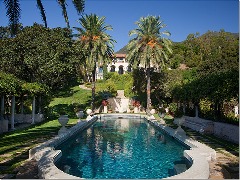
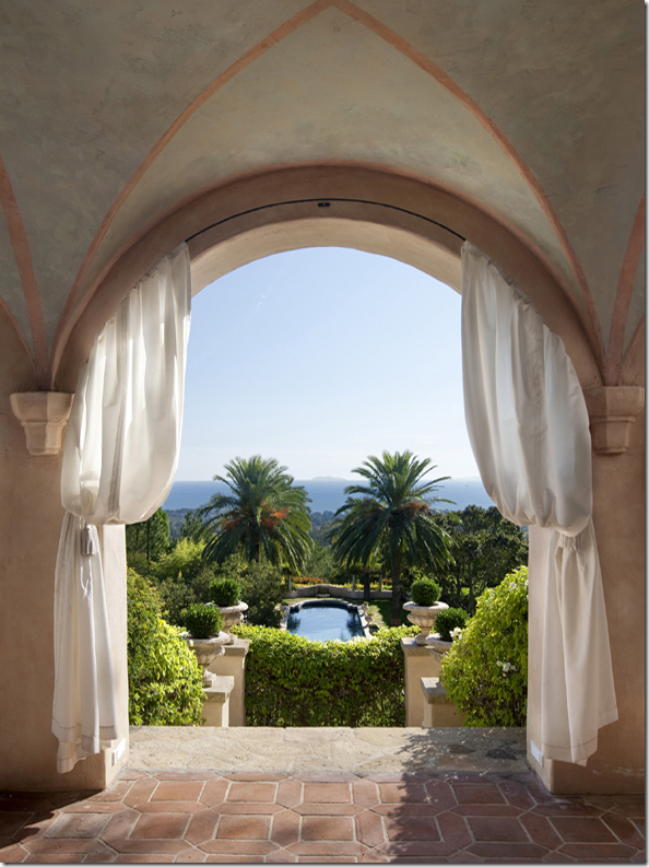
The view of the pool and ocean from the loggia.
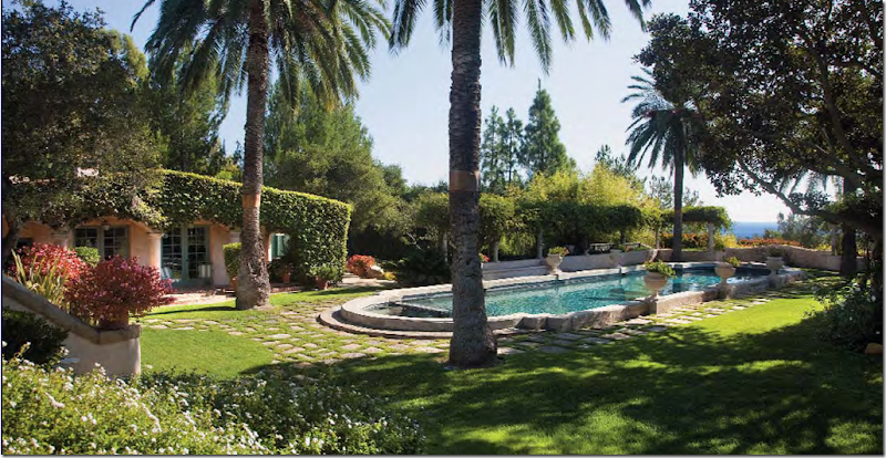
The pool and the ivy covered guesthouse. Behind the guesthouse is the tennis court.
A decade ago – the guest house was furnished with a large painting of the Dutch Indies and a collection of Mexican furniture. I wonder what it looks like today?
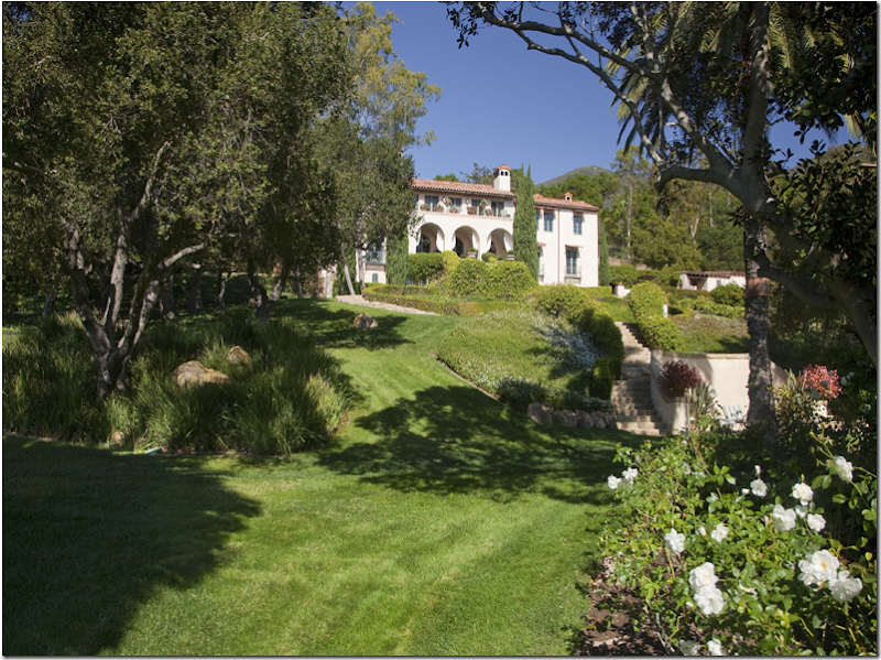
The steps leading from the swimming pool up to the house. You can see the loggia and the balcony above it.
The guest house is on the left of the swimming pool and the pergola is to the right. Diandra didn’t want the facade and grounds to be a caricature, rather she wanted the house to actually seem as if it was in Spain – a country she grew up in. Doesn’t the ocean look really close by?
The courtyard. At the front side of the house is the courtyard. The house wraps around the courtyard on the side opposite the ocean view.
And towards the front of the property is a hidden Japanese garden and teahouse.
The Property:
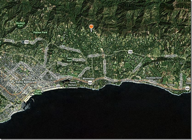
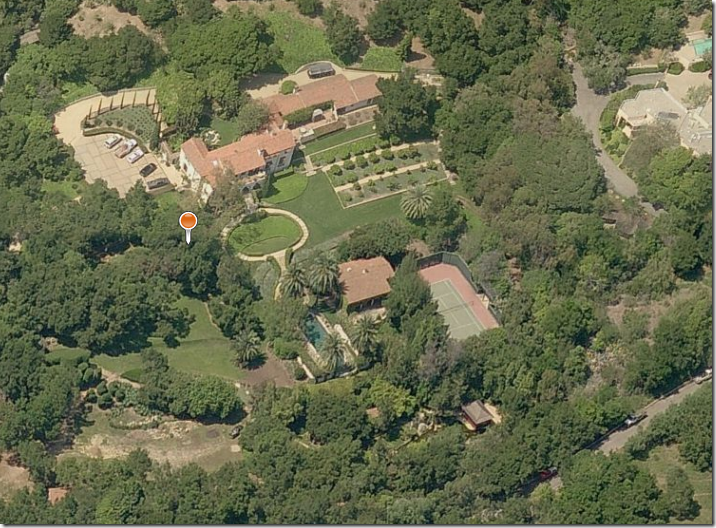
Doesn’t the property look close to the ocean? Actually it’s high up in hills which gives that illusion. Here is the location on the satellite – where the orange marker is. I was amazed how far away the ocean truly is, yet the view is still fabulous. Others who live somewhat close by are Oprah Winfrey, John Saladino, and Kathryn’s Ireland’s former ranch – all are in this general area.
And here is the Bing Map of the property. The main house is on the left. You can see where the interior courtyard is on the back side. The larger building on the right is the garage and staff bedrooms. You can see the orchard is right in the front of the garage building. The pool house is visible and the tennis court is to its right. At the bottom right you can see the Japanese tea house. The property is seven acres.
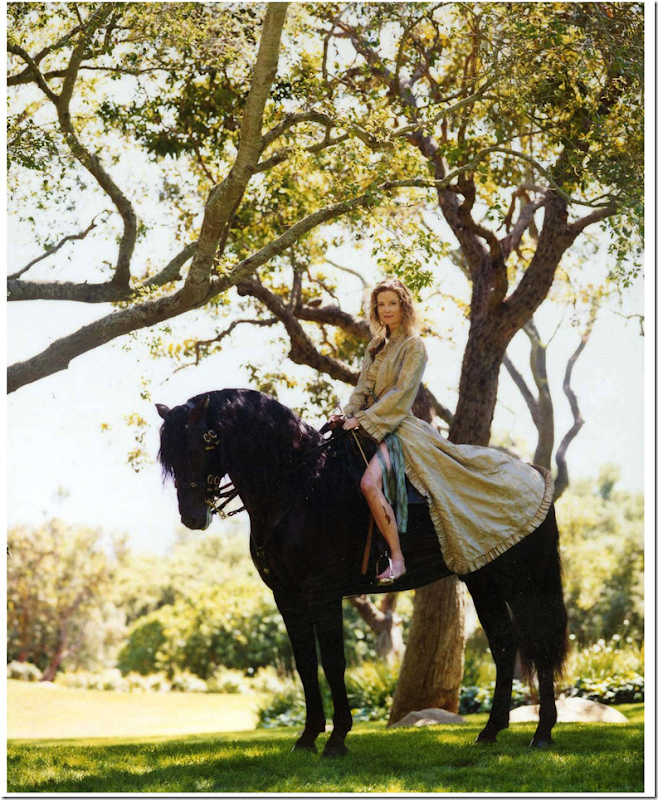
Diandra Douglas is an excellent equestrian who also breeds horses – which she keeps at a nearby stable. Her primary residence is in New York City.
To see the real estate brochure, go HERE. The above picture comes from Santa Barbara Living by Dianne Dorrans Saeks, available HERE. To read Style Saloniste, Saeks’ blog, go HERE. Saeks just returned home from an extended visit to India and she is writing about her journey, truly fascinating reading.
