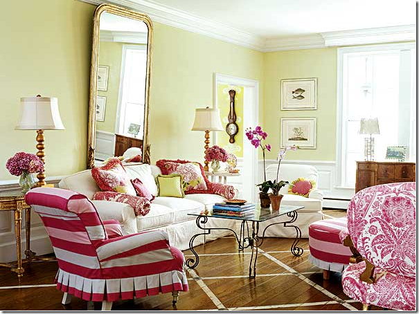
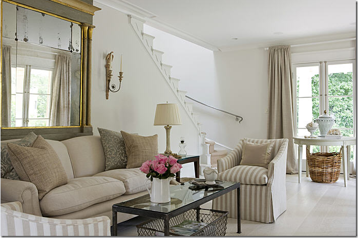
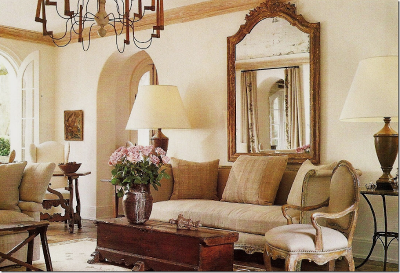
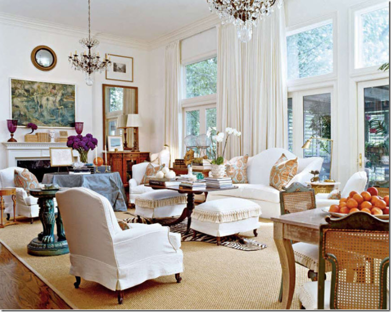
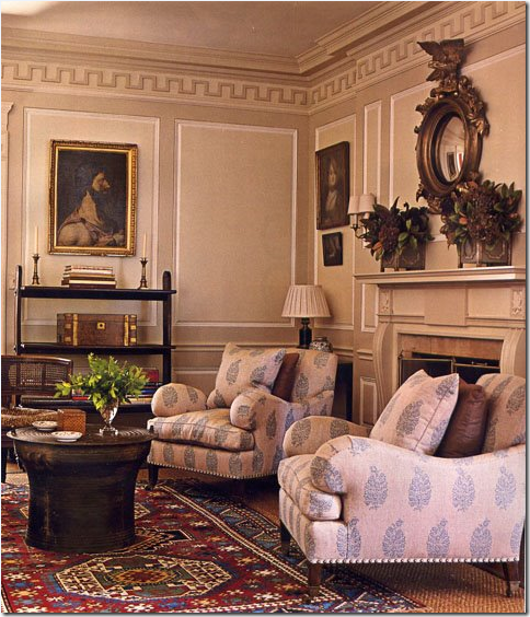
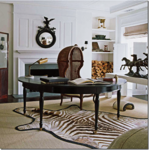
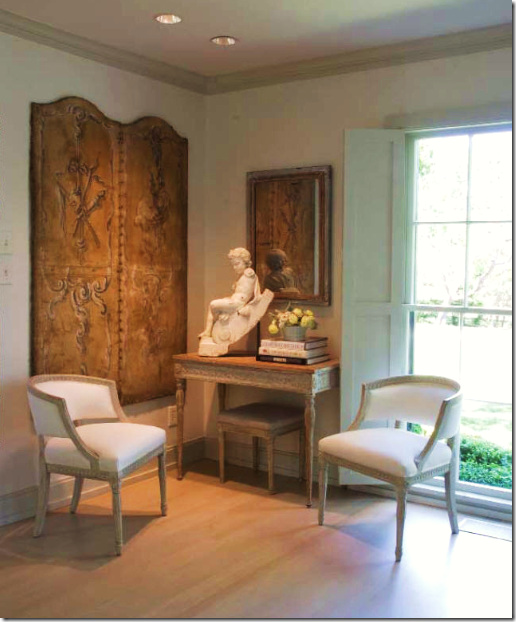
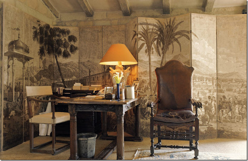
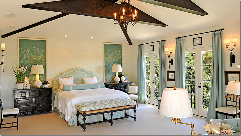
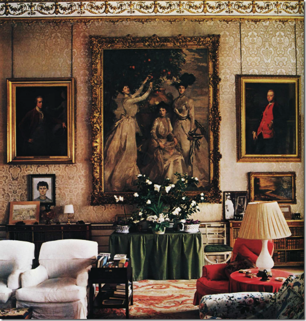
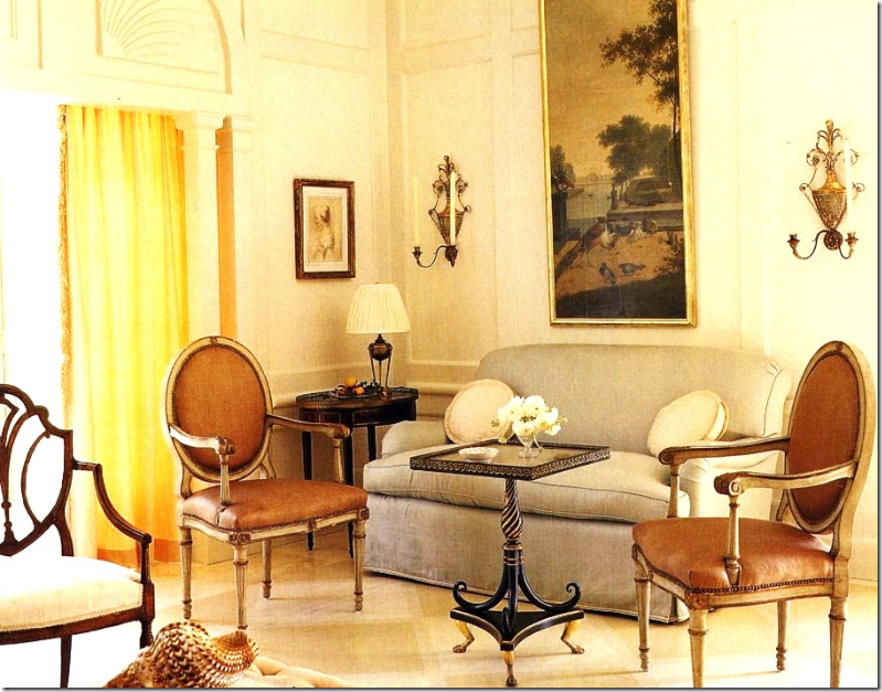
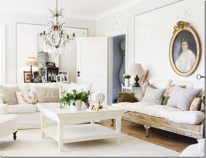
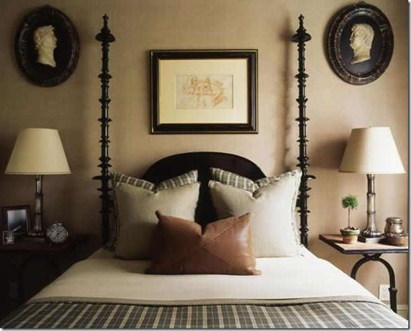
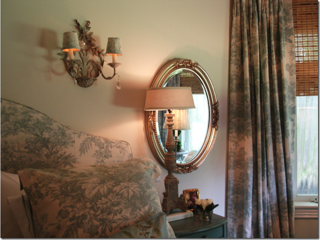
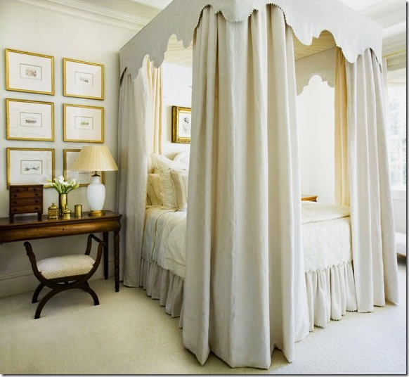
The Top Ten Design Elements – what are the ten things that when I see them in a room, makes me love it? What elements do I need to see in an interior to be interested in it – to invest time in it – to want to spend time in it? Linen is at the top of the list because it sets the whole mood – the comfortable, dressed-down room, the cozy, friendly, inviting space that is at the heart of my favorite rooms. Slipcovers are an important part of that look, incorporating the linen, while seagrass grounds the room, adding a casual texture. Curtains play a role – framing the windows, adding a softness and just a hint of glamour to all the relaxed elements. And, finally chandeliers and sconces are the jewelry of the room – creating the atmosphere and mood, while bringing the ceiling into prominence – which can be especially great when there are beams and rafters. What is next – what else makes you weak in the knees when you see it in a room? What makes you stop and wonder - “who designed this?”
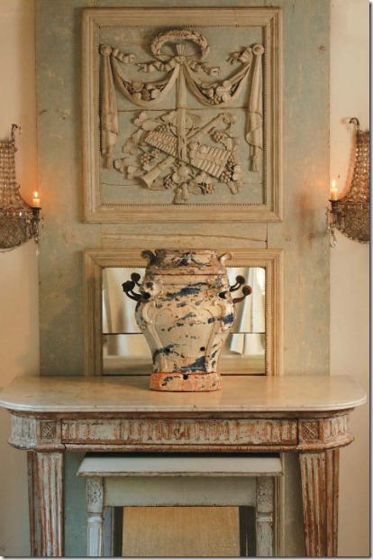
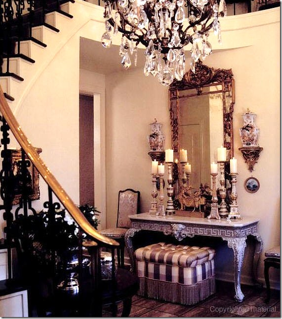
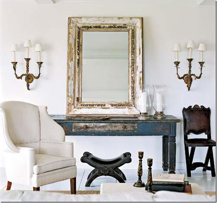
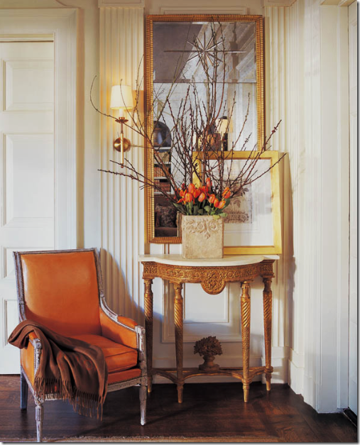
Number Six on the Top Ten list is wall hangings – mirrors, murals, screens, art work, wallpaper, or porcelains – take your pick, any of them are wonderful on a wall, they allow the eye to settle on a focal point. My personal favorite wall hanging, the one I turn to over and over again is the mirror - be they rectangular or round, square or oval, antique or new, dressy or dressed-down – I love them all. In fact all the different wall hangings shown today are items that would be welcomed in any favorite space.
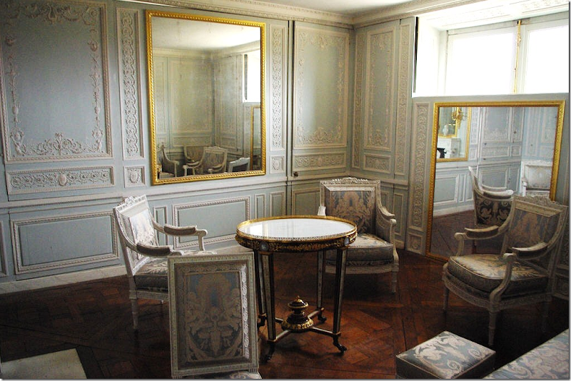 Petit Trianon – Marie Antoinette’s Room of Mirrors
The ultimate historical use of mirrors – at Petit Trianon: Marie Antoinette had mirrors installed that would go up and down to expose or hide the windows – as a hurricane shutter might do, but prettier. Look at the wonderful carved, lacy molding – more lace like shapes appear in the filigree of the table and the chair carvings. Even the upholstery looks lace-like. Such a quietly beautiful room – the mirrors are the main decorative element in the room – just as they can be in any room where they hang.
Starting with the entry hall – a mirror is a traditional wall hanging in this space. Usually placed above a console, as shown here – this mirror appears wider looking with the addition of the wall sconces and vases. Charles Faudree.
Entry halls don’t have to be as fancy as Faudree’s. I love this simple and relaxed foyer. The gilt mirror is the polar opposite of the rattan trunk and the English hall chairs. And notice – the sconces are attached to the mirror. Many mirrors were originally made like this so that the candlelight would be directly reflected in the mirror and become doubled in brightness.
 An original Louis Philippe mirror – with its glass made of two pieces – rests on a console, the framed prints push the visual line wider. A mixture of rustic and elegant, smooth and rough, makes this vignette all the more appealing.
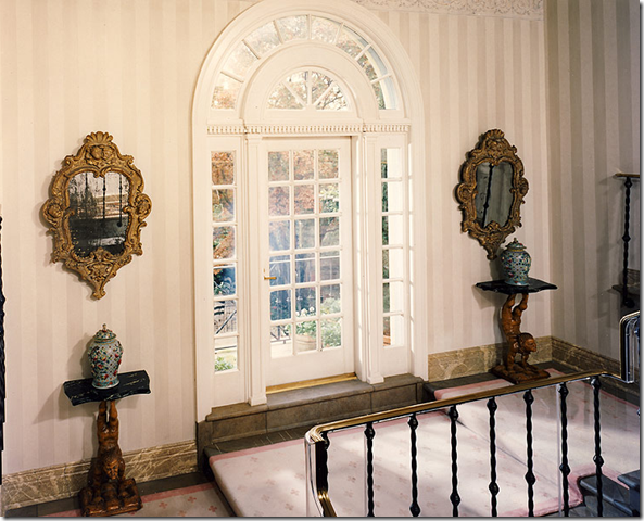 On a beautiful stair landing, mirrors flank the door in an unusual, but beautiful placement.
Darryl Carter goes rustic with this mirror and console, yet the dressy sconces and intricate lines of the chair keep this vignette from being casual. It’s all about the mix, which he does beautifully. Each piece is a surprise here – and Carter keeps it interesting with his diverse choices.
Layer your artwork against a mirror – the effect is so interesting and brings the formality down.
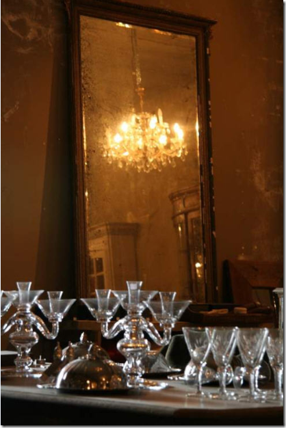 I adore this picture – a peeling, once grand gilded mirror – with its reflecting ability almost gone – takes on the role of a dowager queen. I love mirrors that are so old you can barely see yourself in them anymore.

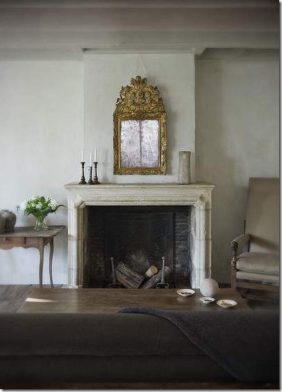 Here, a small, but very ornate antique mirror above a mantel shines in a sea of gray. Again, the glass is so aged, not much is reflected anymore, which only adds to its charm.
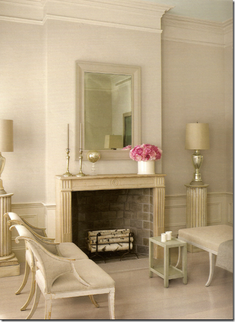
In this Swedish inspired living room, the mirror’s frame is designed to melt into the wall, leaving the glass to sparkle along with the mercury lamps. I love the birch wood in the fireplace and the touch of pink – great styling!
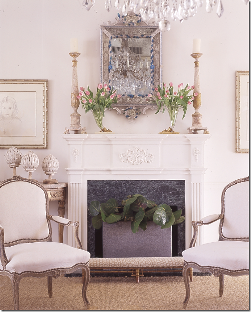 This small Venetian mirror is quite beautiful and reflects a chandelier, properly – but a closer look reveals the air conditioning vent is reflected too – try to avoid this at all costs!
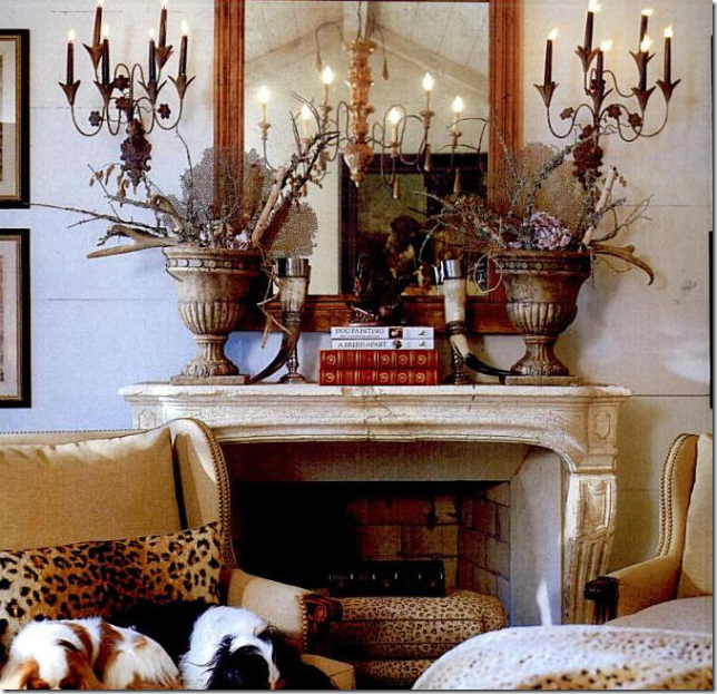
Much better – the reflection in this mirror is exciting and interesting. Just don’t light the fireplace. The dogs should tell you who the designer is!
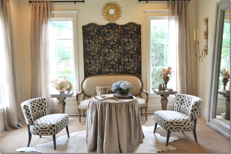
In Sally Wheat’s living room, no typical “art” work hangs, instead she chose to use two mirrors and a screen to create interest. Imagine this room without one of the three pieces – it would not be quite as perfect. The sunburst mirror fills out the small space above the screen, and the screen adds pattern to the room. The tall mirror brings the outdoors inside – making it all just a little bit brighter. I love this room - I adore the mix of the antique with the modern, perfect for a young family like the Wheats. But, Sally disagrees. She has completely dismantled the room and is redoing it, now as we speak. The settee is for sale, and I made Sally drag it over to my house – I love it so much – but its scale was just too big for my smaller house.
All in cream and white except for the Louis Philippe mirror. These mirrors are relatively easy to find in any antique store and they are usually reasonably priced. This along with their clean lines and slightly arching top explains their popularity.
Another Louis Philippe mirror – this time in a bright and colorful living room – so cute!!
A beautifully painted mirror - with its glass broken up in several pieces. Usually this is a sign of age – if the large expanse of mirror is actually more than one piece. A mirror above a sofa is another popular place to put one, instead of art work. Tone on Tone’s owners live here – amid beautiful antiques and more rustic accents. I love this room!!
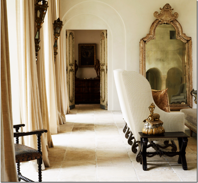
An arching mirror and an arched doorway. This glass is broken into two pieces – again, a sign of its age. Design by Pam Pierce. I’ve heard this house is being totally remodeled – and can’t wait to see what direction Pierce has gone to – it’s said to be completely different and I can only imagine how absolutely wonderful it must be!!!
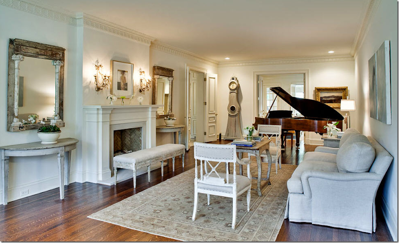 If you don’t put a mirror over the mantel – flank it with two, either matching ones, or ones that match in size. I know these mirrors look old, but I would guess they were made of old materials instead. How rare would it be to find two mirrors so exactly alike, so old? But, it certainly wouldn’t stop me from buying them! I love them – old OR new!
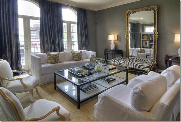
Houstonian interior designer, Lisa Epley (who is one funny crack you up lady – I’m crazy about her!) used an overscaled mirror in her living room. Flanked by oriental demilunes and fronted by a fabulous zebra upholstered bench – the mirror expands the size of the room. It almost looks like a door into another space.

In this living room, the arches of the floor mirror mimic the archway of the door and the arch of the settee’s back. More arches are reflected in the mirror. Coincidence? I doubt it.
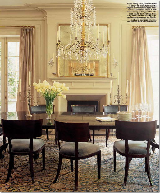 Dining Rooms are perfect places for mirrors. Here, this owner is lucky enough to have a fireplace in the dining room – and the mirror above it is the perfect choice.
In this dining room, an interesting mix of centuries makes it visually exciting. The large Regence mirror is so ornate juxtaposed to the modern light fixture and table. Fabulous!
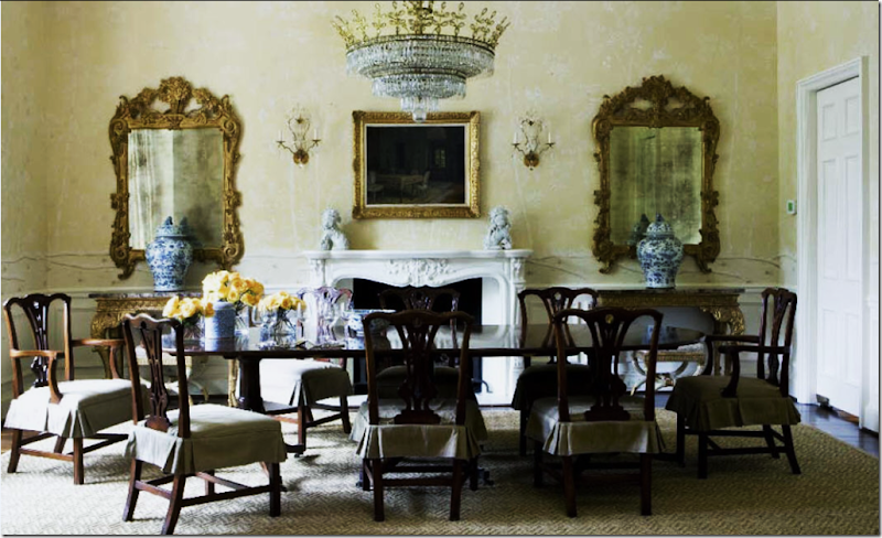 Instead of using the mirror over the fireplace, Suzanne Kasler chose to put two flanking it instead. Such an elegant and dressy room, yet the linen slipcovers and seagrass rug bring it all down a notch – perfect for a younger family – with grandmother’s inherited dining room set.
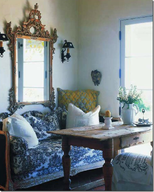
A rustic table and sofa mix with a dressy carved mirror.
Use an extra large mirror if you want to increase the room’s appearance. This room looks twice as big as it really is, due to the mirror.
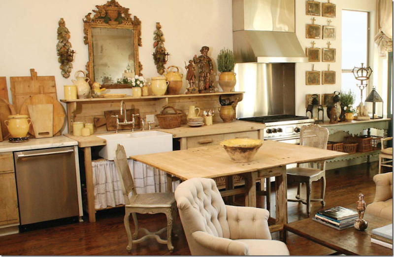 Houston great Jane Moore uses a mirror in her eclectic kitchen.

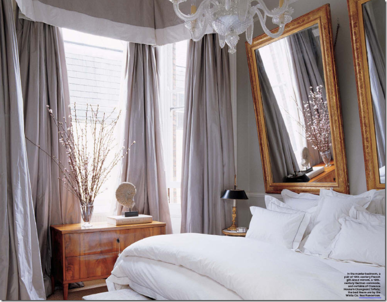
I’ve shown it before and here it is again – perfection deserves a second viewing. Alex Papachristidis designed this bedroom with voluminous silk taffeta curtains and wonderful antique furniture – but the two mirrors that act as a headboard steal the show – they are fabulous. Notice too how the mirrors are hung – from chains that allow them to reflect a lower view. If you hang a mirror flat to the wall – many times you get a boring view of the ceiling and a few air conditioning ducts. Hung by chains, the mirrors tip down slightly giving a totally different perspective. Try it – it’s worth it! You can actually see the chains in this picture.
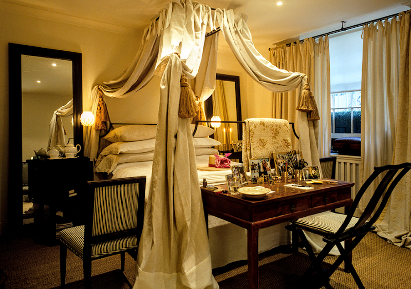
Mimmi O’Connell’s own London bedroom is dreamily draped in linens. Her iron four poster bed is her trademark, as are the Oriental chairs and tables. The twin floor sized mirrors match the drama of the bed. I love to use mirrors to flank a bed – it is a wonderful way to enhance a focal point.
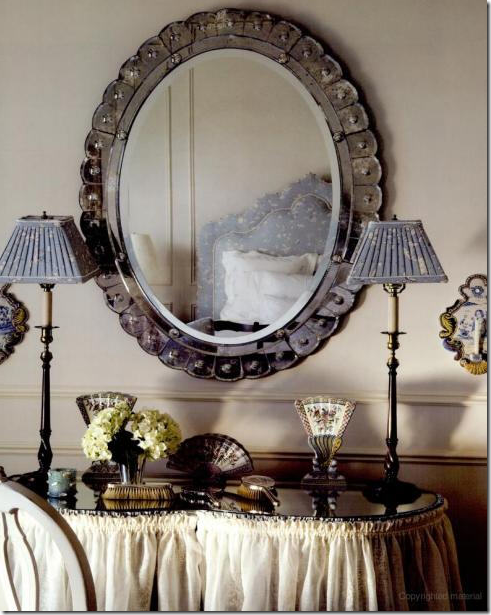 Oval mirrors can be romantic – as this Venetian styled mirror is.
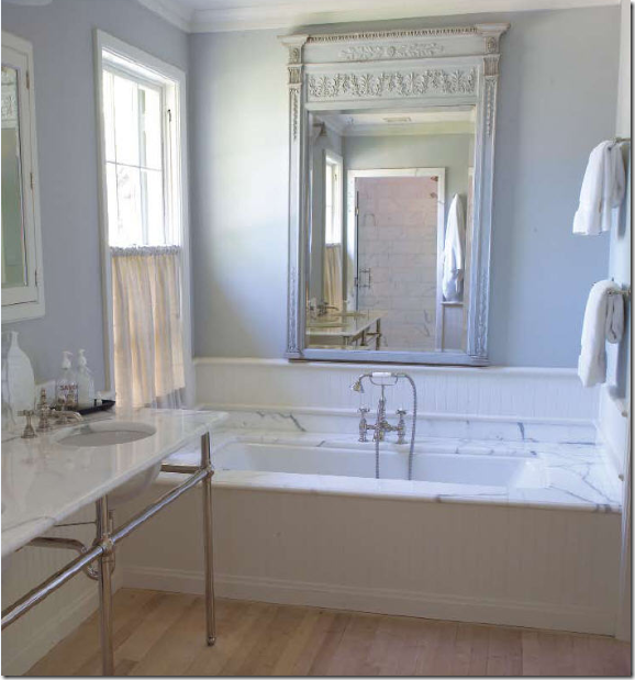 Mirrors in bathroom don’t have to be utilitarian. Jane Moore, again, used this classically styled mirror above the tub in her daughter’s house.
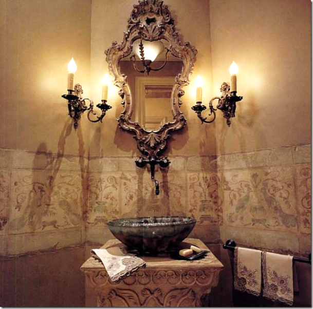
Powder rooms are the place for the most ornate mirrors, the smaller the better sometimes!
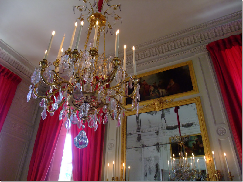 Trumeaus are a mixture of art and mirror – perfect for people who want both. Here, an original trumeau in Petit Trianon – with its divided and cloudy glass. The Petit Trianon has just undergone a massive restoration and while it looks like the gilding may have been restored – the glass was left untouched, thankfully!
In her former house, Suzanne Kasler had this trumeau over her fireplace.
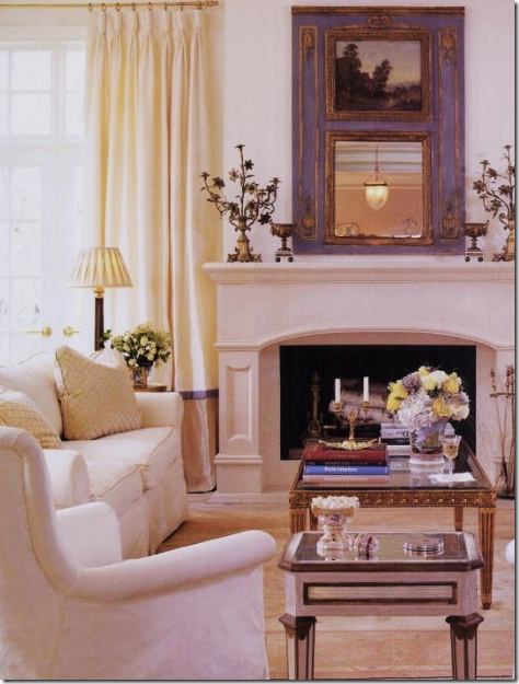
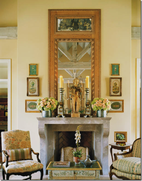
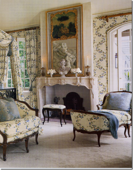
Another original trumeau, judging by the glass and the attached sconces. It may even have been attached to the mantle.
It is hard to tell if this trumeau is actually two mirrors, or a painting and a mirror. But what a beautiful reflection!
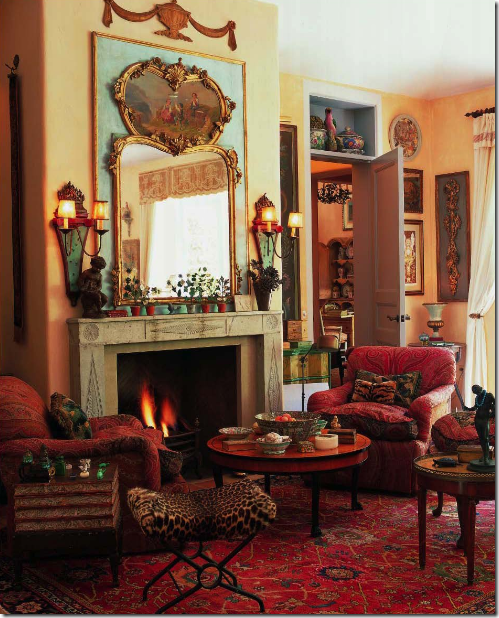 Interior designer and blogger commenter Penny Bianchi has this wonderful trumeau in her living room. It is so romantic with its cartouche shaped frame.
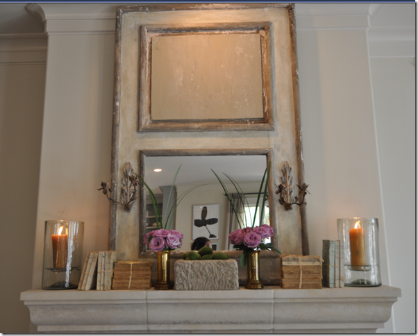 Sally Wheat’s trumeau is missing it’s painting – or it may have been made that way. I love this mantelscape.
Another ultra romantic trumeau in an even more romantic bedroom.
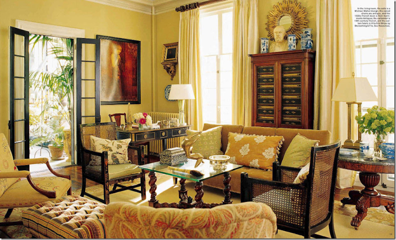
Sunburst mirrors have seen a huge resurgence in these past years. Their round and pointed shapes make them wonderful accent mirrors, especially the smaller ones.
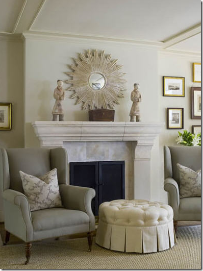
Here, a larger reproduction sunburst is the focal point above the mantel.
This sunburst mirror is the center of a collection of framed prints – a great way to mix mirrors and art.
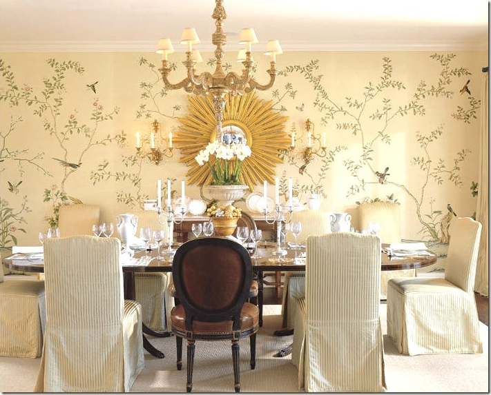
This sunburst mirror actually overshadows the gorgeous wallpaper.
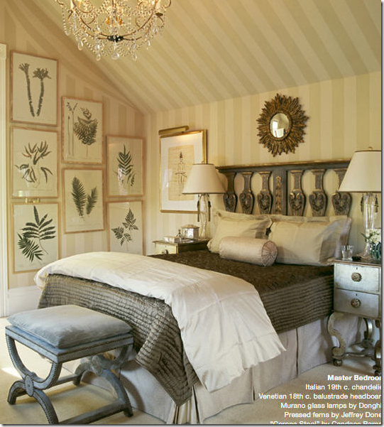
This bedroom mixes the sunburst over a headboard made from an 18th century Venetian balustrade. The botanicals are wonderful elements to hang on the wall – instead of pricey art.
It’s made it for six times now – this picture is going for broke. I am curious how many elements it will end up with – all ten? Linen, slipcovers, seagrass, curtains, chandeliers, and mirrors. Here, a small convex mirror is perfect for filling out a blank spot. Convex mirrors have such an interesting reflection – I like to use them above mantels where you can really see the image.
Federal styled convex mirrors are more ornate than plain ones. Here Suzanne Rheinstein uses one in her family room. These chairs are her design and they are truly fabulous! Those arms – they would be so hard to replicate in an workroom – the proportions would have to be copied exactly, which would be difficult.
Darryl Carter uses a black Federal convex mirror above his fireplace. As usual – he mixes in a host of different styles and elements to create the most interesting rooms!
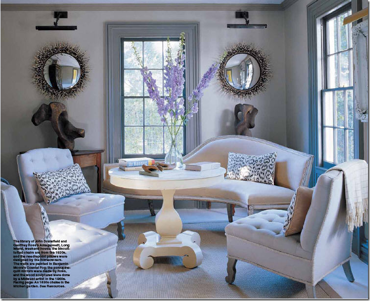
Here a pair contemporary styled convex mirrors really steal all the attention. They are edged in porcupine quills. Another element to really notice here is the window trim. It is so thick, so wide – and painted a slightly darker shade – the molding almost acts as curtains would to frame the window. Though I am a huge advocate of window coverings, I love the owner’s choice here to leave the windows bare, especially with the round mirrors – which soften the edges. Very interesting!
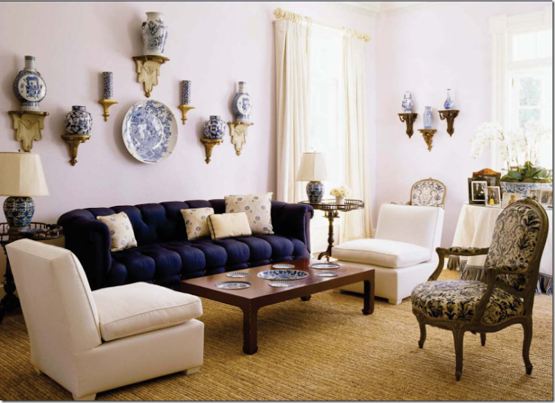
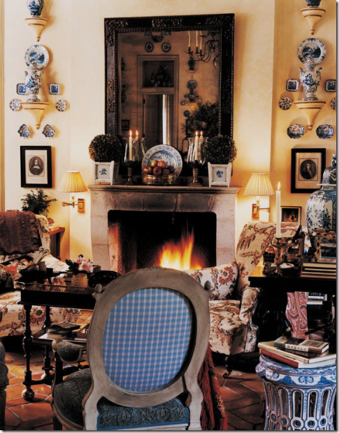
Another design element for the walls is plates – I love to use plates on the wall in place of art. The plates can be rare and antique or something as plain and simple as a set of white dishes from Ikea. I love when the walls are dark and white platters pop against the color. Here, a fabulous collection of blue and white export is placed above the sofa – some plates hang, while vases rest on pedestals.
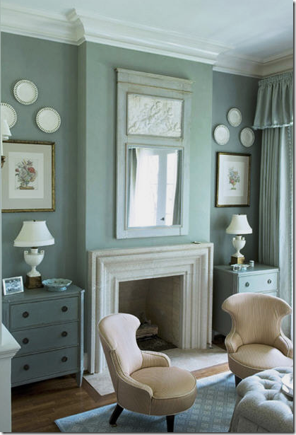 Here in a subtly Swedish styled room – done in a grayish blue, reticulated creamware flanks a trumeau. Notice how the painting in the mirror is also creamy – just beautiful. I love the way the plates arch above the botanicals. Everything is so wonderfully symmetrical – neat and tidy, serenely beautiful!
A collection of blue and white export – plates and vases – encircle a mirror. Here, the more the better.
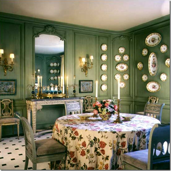 Rather than store away a beautiful set of porcelain plates – why not display them on the walls. It’s hard to imagine how this room would look without all the delicate plates hanging.
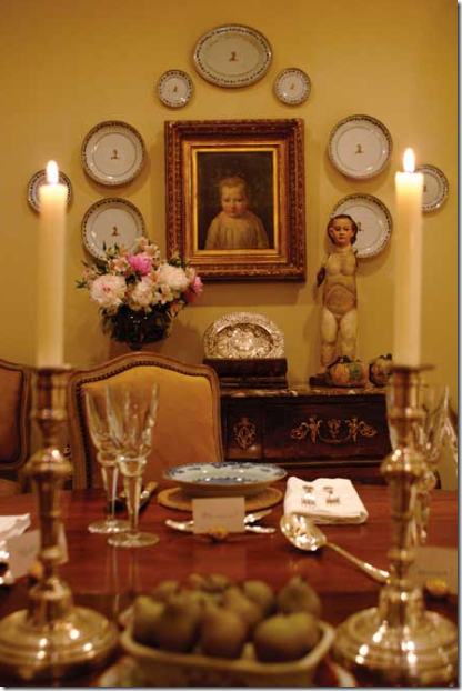 Dining rooms are traditional places to hang plates – here the set encircles a small piece of art work, stretching its edges and making it appear much larger and more important. Plates are wonderful to use for this purpose – if a mirror is not wide enough for its consoles – flank it with plates to enlarge its presence.
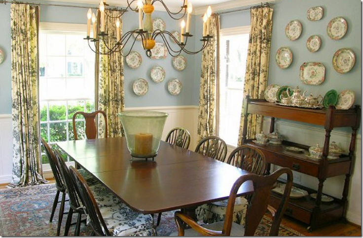 I love this charming and warm dining room – the plates add so much interest to the room. This room is from a “real house”—which I love. It is a regular sized room, not overscaled, with simple toile curtains and Windsor chairs – easily purchased at any price. Nothing screams decorator or money – yet it is so cozy and something to inspire to if you like this look. The plates really give it just that something extra.
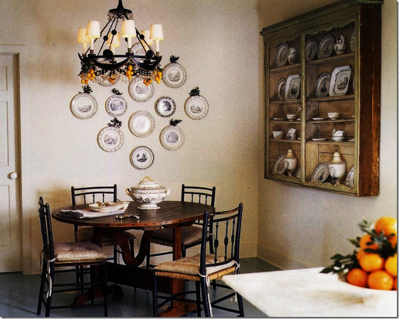
Plates don’t have to be dressy or in the dining room – here in a kitchen/breakfast area, black and white transferware hang on one wall, while a hanging shelf holds more. Suzanne Rheinstein.
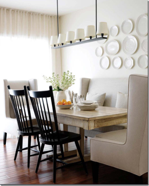
A more contemporary look – with a simple collection of white plates that play against the shaded light fixture.
Houstonian antiquarian Donna Brown used creamware platters in her kitchen. They flank an antique tole tray – I love this look and this kitchen, it’s wonderfully original. But – you can see that the reason Donna put the plates there is to make the short wire piece look taller. Plates help fill out spaces and make a piece look taller or wider.
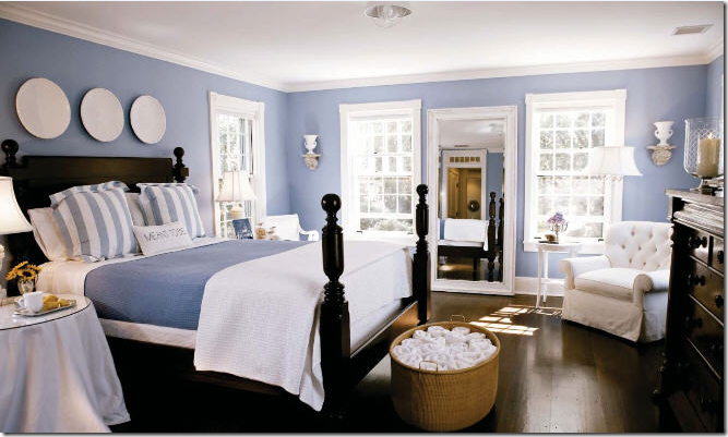
Take the plates out of the dining room and bring them in the bedroom. Here a simple row of three large plates that pop against the dark blue paint. I have loved this picture for a while – but really, what I love is the large white plates – that one detail can really make a room special.
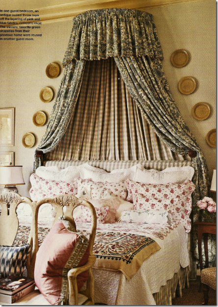
I adore this bedroom with the toiles and checks. But the yellow ware plates flanking the bed are what I notice the most.
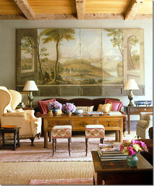
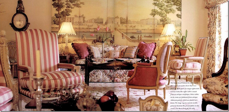
Another way to add interest to the wall is through screens – here a screen with a mural painted on it is hung above the sofa. One of my favorite images from the late, great Southern Accents, Amelia Handegan.
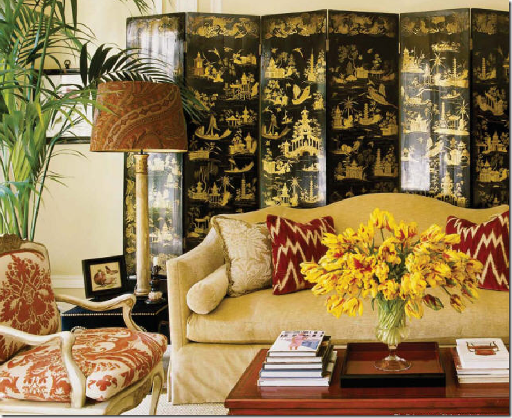
Oriental screens are wonderful to use too – this black and gold Chinoiserie screen adds so much – color, texture, sheen, and glamour - to Alessandra Branca’s NYC apartment. She always likes to use a touch of black and red (and yellow!) in each room. It’s her palette.
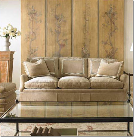 This softly painted screen adds just a whisper of color to this neutral room.
I have long admired this dining room from Gerrie Bremermann, with its urn table, check fabric and large Chinoiserie screen. This room was furnished years ago, yet to me – it looks like it could have been done last month.
Beautiful screen – with a mural painted on it. I love screens in dressy rooms.
In this Swedish inspired house designed by Jane Moore, a mirror reflects a very muted screen – again, it is hard to imagine anything but this screen in this quiet room.
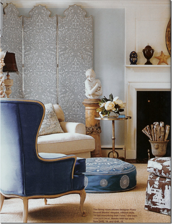
Fiona Newell Weeks created a screen out of Fortuny fabric – its cutout top creates extra drama. Fabulous room! This was a popular blogosphere room.
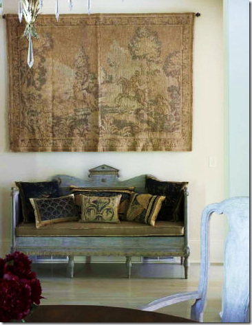
Similar to screens, hanging a tapestry on the wall is one way to add color and interest on the walls. The grays in the Swedish sofa are picked up in the tapestry – and Suzanne Kasler added the beige cushion to further bring out the subtle colors in the tapestry.
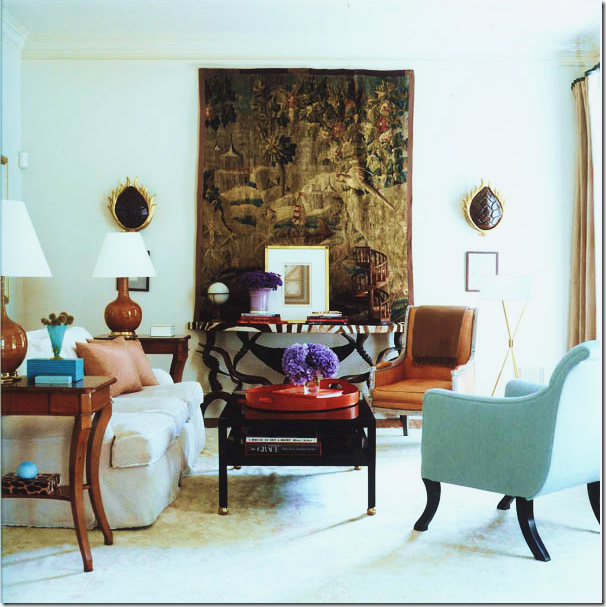 Kasler, again, – her fabulous family room. Once she bought the tapestry, she had no wall to hang it on, so she took out a window just to have a place for it.
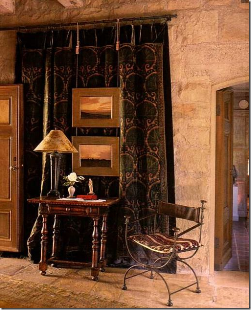
A tool that John Saladino employs is to layer mirrors or paintings over antique textiles which he hangs from drapery rods. This is the entrance foyer to his gorgeous Villa di Lemma.
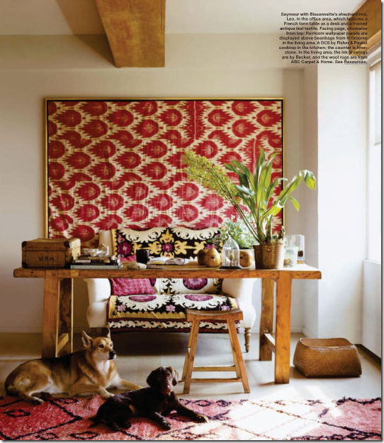 A trendy and inexpensive way to bring in a hanging textile - frame a Ikat. Since most of us can’t afford pricey tapestries – try an Ebay bought Ikat for a similar, but more youthful look. Can you count the trends in this room?
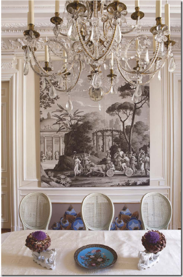
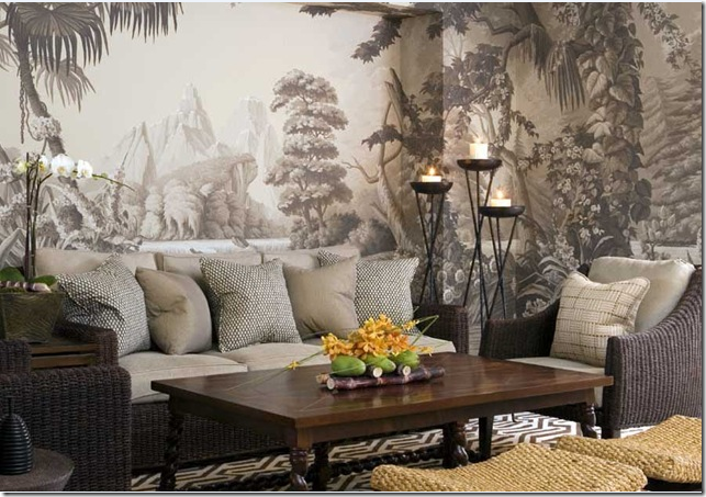
Murals are a personal favorite of mine, especially the grisaille ones – or gray ones. This mural looks like it was attached to a board and is leaning on a ledge.
A deGournay grisaille wallpaper. I like the relaxed interiors mixed with this wallpaper.
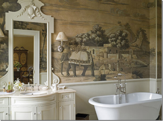
What extravagance!!! A de Gournay mural in a bathroom.
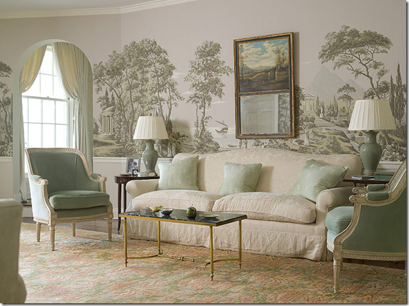 What a pretty living room – again, a beautiful wallpaper.
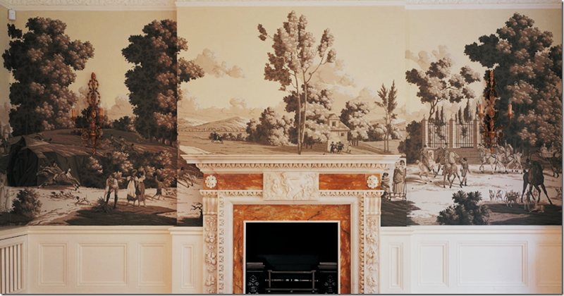 A large de Gournay mural runs around the perimeter of this room. It depicts an estate in the countryside – all soft and so romantic.
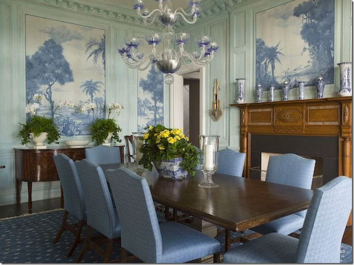 These murals were handpainted – in blue tones to match the decor. Phoebe Howard.
In John Saladino’s bedroom at Villa di Lemma, he has a screen with an antique Zuber wallcovering depicting a scene from Napoleon’s time. Compliments of Trouvais.
Framed wallpaper on each side of the bed looks great – handpainted wallpaper can be ordered in single rolls and then framed – it’s a lot cheaper than doing an entire room in it.
Hard to imagine what this cost the homeowner – the painted mural goes up three stories. Mario Buatta.
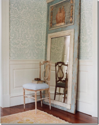 There is such a resurgence in wallpaper today. My favorite wallpaper of all is Farrow and Ball. This particular paper looks wonderful in person.
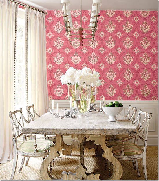 The younger generation really likes the bright wallpapers and are behind the current rage. I think this bright color looks wonderful mixed with the bleached furniture.
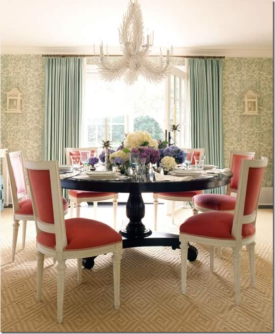 The dining room by Ashley Whittaker is a study in opposite colors which is a great design tool that Suzanne Kasler loves to utilize too.
Art work is of course what most people have on their walls and how boring would it be to have a room with nothing hanging? The problem is that art work CAN be expensive, especially if you are particular about what you like. For me – this is the ideal room, found at Chatsworth. Oh, to live here, I can’t even begin to imagine what it would be like to have morning coffee here and a late night drink – being surrounded by such beauty!

Even just one small canvas is so effective. No frame, just the board with a handsome man in a white collar. Belgian design, simple yet elegant.
This room, with a single canvas, flanked by sconces, designed by Suzanne Rheinstein, has long been a favorite of mine.
I adore portraits, old ones, and especially those in oval frames. This room is so wonderful with its white and muted colors. I love the glimpse of the Mora clock in the next room.
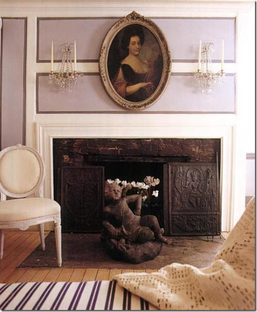 In this Swedish inspired house, a beautiful old portrait of an elegant woman – in an oval frame – softens the straight lines of the mantel. The painted molding plays up that element.
Years ago, Suzanne Rheinstein designed this room with two wonderful cameos flanking the bed. Which inspired this:
Another wonderful bedroom, its straight lines softened by the oval cameos.

A wonderful way to emulate the oval look flanking the bed, without a huge outlay of money, is to use mirrors. A few years ago I designed this bedroom on a budget, using mostly items from Pottery Barn. The oval mirrors softened the lines and brought a touch of glamour to the room.
Another design element I adore is groups of prints, framed identically. The prints become a unit, rather than seen individually – as shown here in this bedroom by Phoebe Howard.
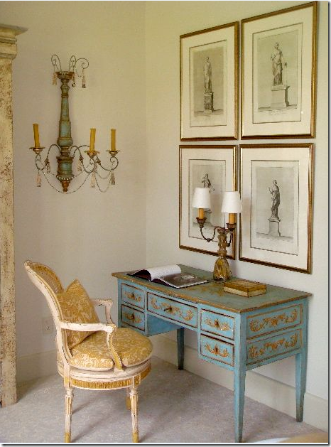 Again, the four prints become one large unit – in this bedroom by Katie Stassi, my current favorite!
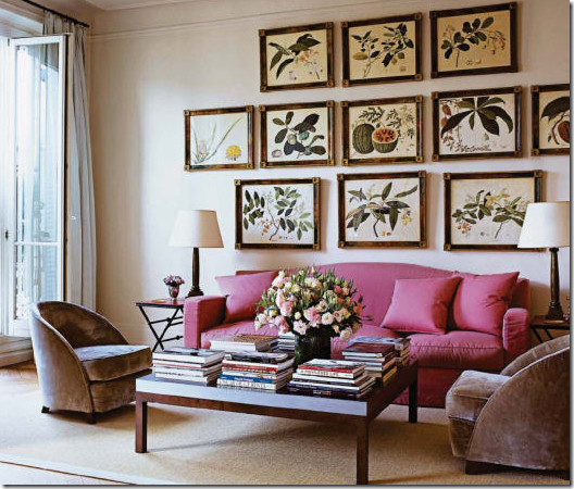 This vibrant set of botanicals, beautifully framed – make the room come alive. Hanging a set of prints can be nerve wracking. A foolproof way to do it is to cut each shape out of paper and tape the paper up until the arrangement is perfect.
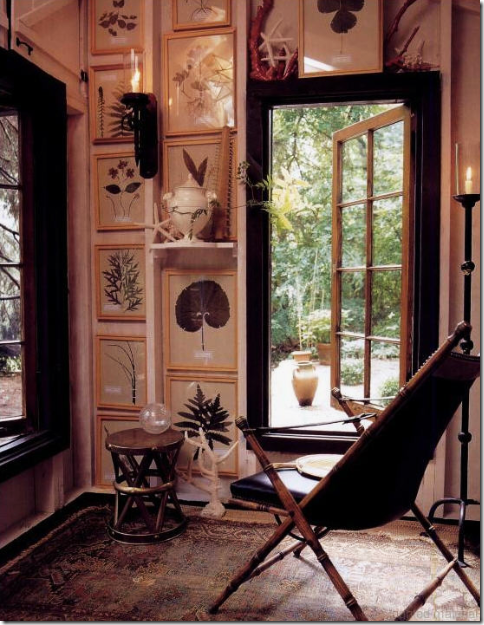 A charming country home – with exposed wooden walls becomes even more charming with the floor to ceiling botanicals of all sizes – the identical frames though connect them to each other, visually.
 Ah, the famous Swedish bird prints – made popular by Anthropologie a few years back. These, though are probably originals. Hanging this set must cause such a headache! When hanging sets – try to always have the same amount of space between each frame, on all sides. When they are as different as these though – that rule flies out the window and a professional should probably be called in – someone with good spatial skills!
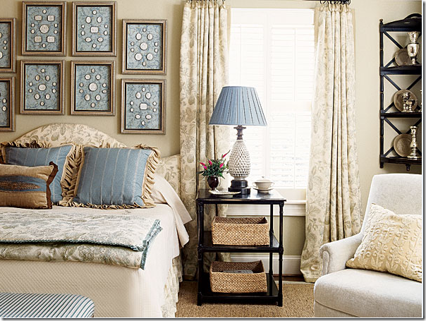 Sets of intaglios have grown in popularity these past few years. Here the blue mat really sets off the white medallions.
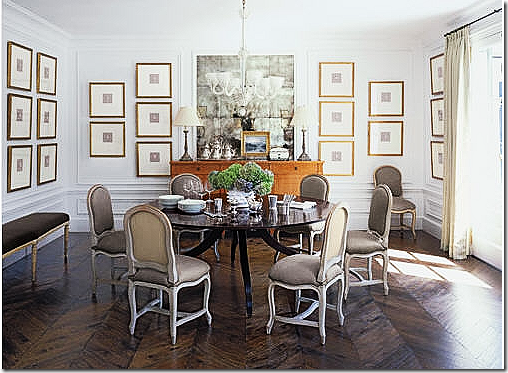 This set of intaglios covers every wall in this beautiful dining room.
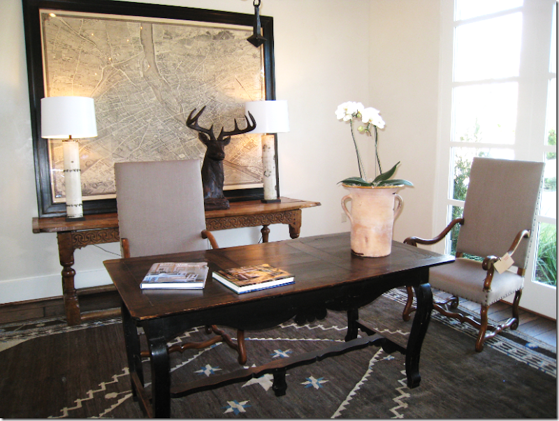
Antique maps of Paris or Rome or wherever are a great design element to use. Here, Ginger Barber used the antique map of Paris to great effect.
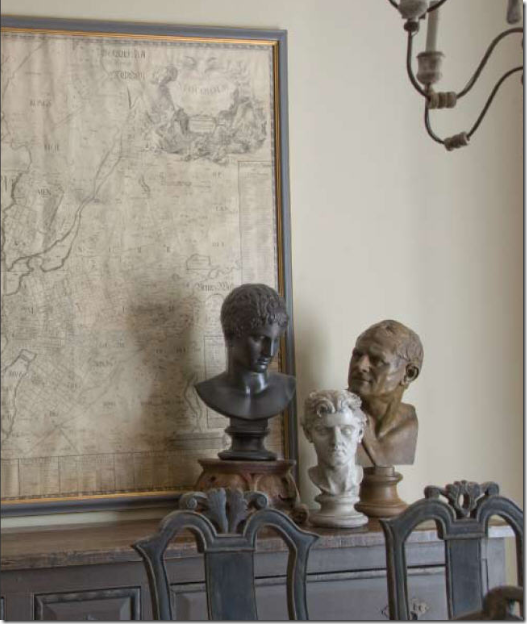
All different shades of gray make this so serene and beautiful.
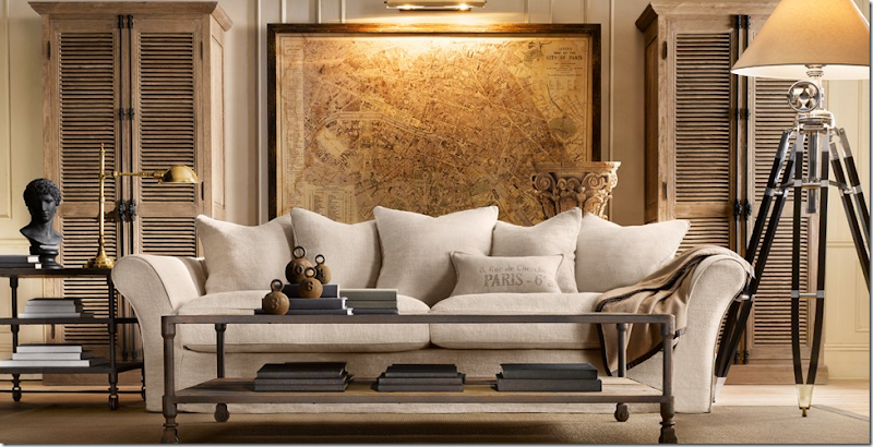 Restoration Hardware introduced this large reproduction of an antique map and caused lots of blogosphere chatter. Pigtown Design HERE had lots to say about the antique maps which prompted Little Augury to discuss the maps even more HERE.
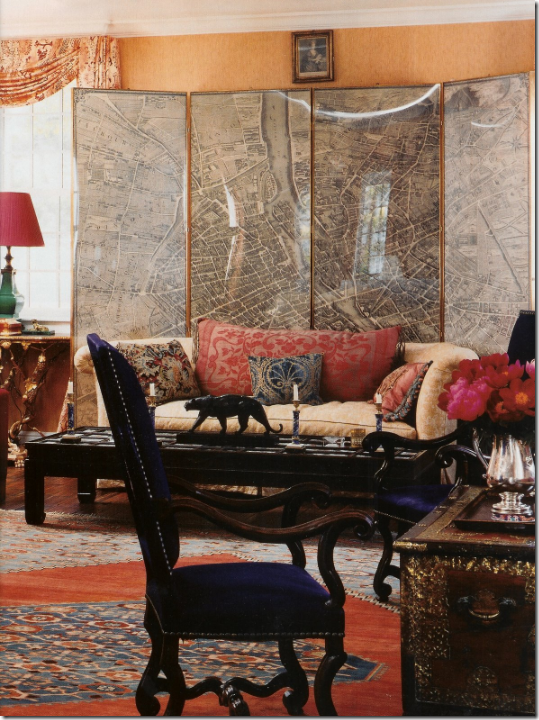 A map and a screen in one – I’m not sure which is more beautiful, the screen or the huge pillow on the sofa.
Antique station clocks – the bigger the better – have become a trendy design element. Of course, places like Target and Pier I offer much less expensive clocks that produce the same effect.
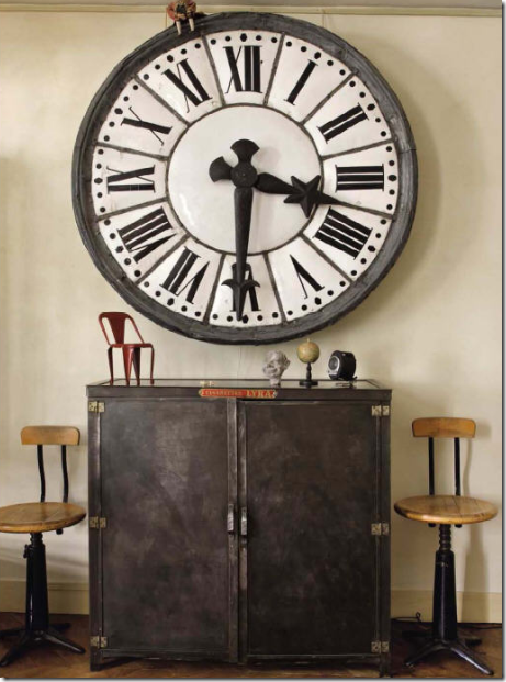 An original antique station clock – in an industrial vignette. Clocks like this can be quite pricey – but they are so beautiful.
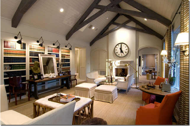 This house in Houston was on the cover of Traditional Home. The large wooden clock is the focal point. After the story came out in the magazine – it was put up for sale.
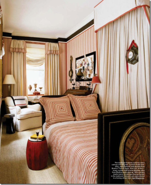
Wall clocks do not have to be oversized to be a focal point. Here, hanging in the folds of a canopy – a small black tole clock garners attention. Alessandra Branca.
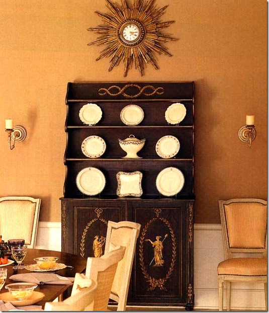
Two elements in one: a starburst clock.
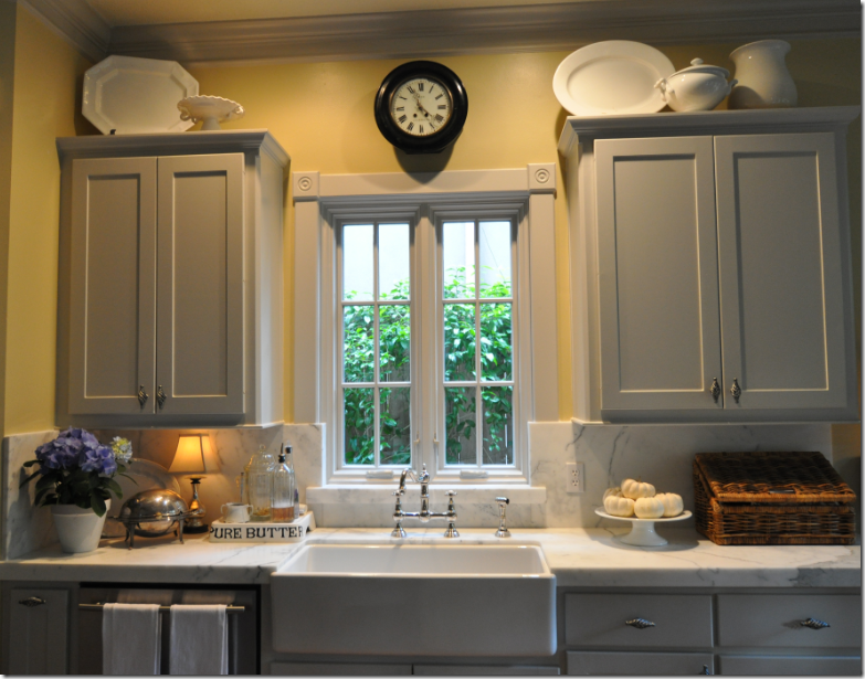
In memory of my late, great clock – purchased at this year’s Round Top. It hung on the wall for almost an hour before it came down, smashing into a million pieces. :( I love clocks that are placed above sinks – it makes a great focal point.
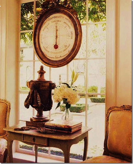
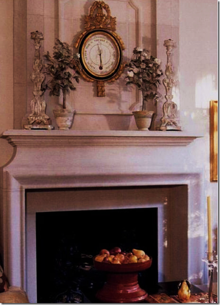 Saving the best for last! French 18th century barometers are the prettiest scientific instruments ever made. I cite that century because I’ve never really seen a reproduction of one. Charles Faudree – who really loves barometers and uses them often.
Barometers just look great with French antiques. This vignette is so beautiful – the chairs, the table, the urn – it’s hard to imagine anything prettier.
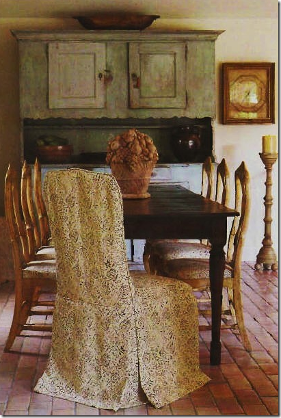 A rectangular barometer rests near the breakfront. Look how beautiful the Rose Tarlow slipcover is!
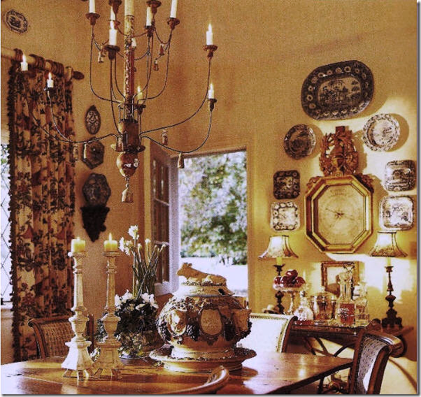
This barometer in a breakfast room is surrounded by plates which dresses it down a bit.
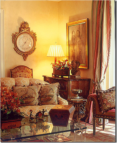 I love this one – it’s really such a pretty barometer with it’s clear and creamy face.
For this living room – my clients bought a long barometer on a trip to Paris, France. It was hung over a pedestal between the two French doors. Webb Design.
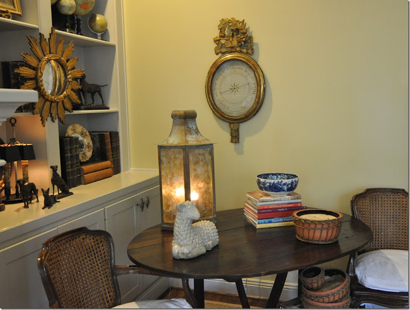
And finally – my barometer. I bought it on 1st Dibs in the steal of the century. I LOVE when I find a real bargain, which I did with this one. I’ve wanted one for ages and when I saw this one and the price (which the seller then reduced by almost half) – I knew I had to do my part for Obama’s stimulus package.
Linen, slipcovers, seagrass, curtains, chandelier/sconces, and wall hangings – the top six elements I love in a room. I hope you got some ideas for what looks great hanging on a wall – and I hope you can see how these elements enhance a room. Watch for the next installment of the Top Ten Decorative Elements, coming soon – hopefully!
And, don’t forget to listen to this week’s Skirted Roundtable, interior designer Suzanne Kasler is the guest. HERE.
