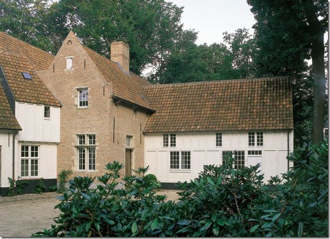
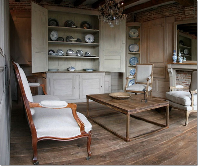
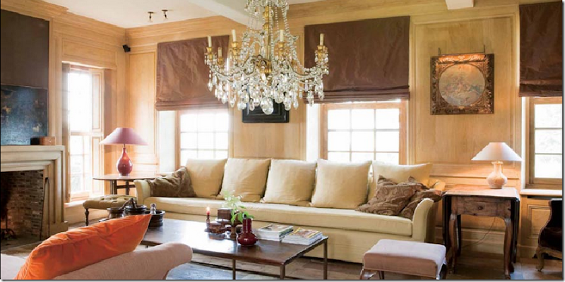
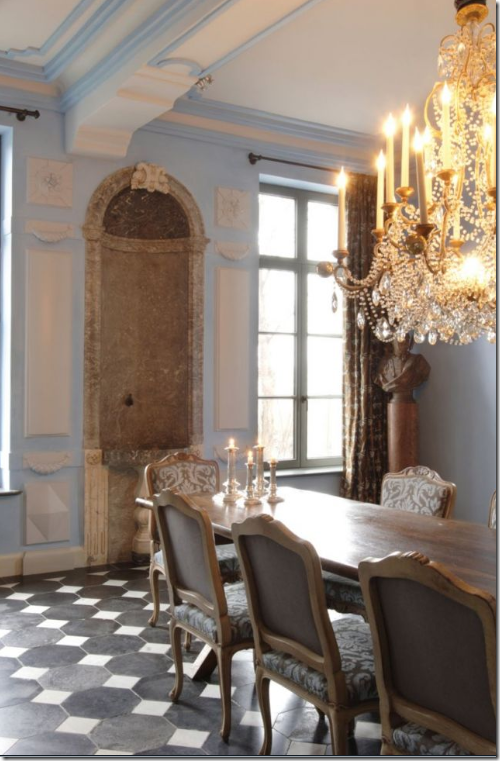
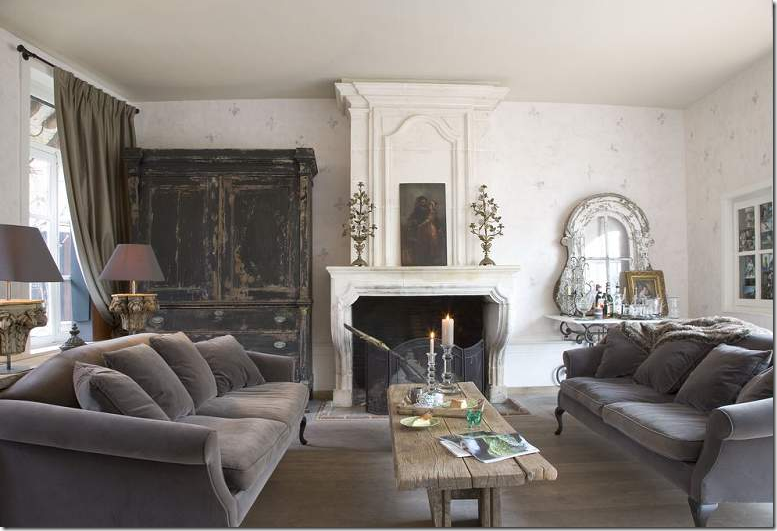
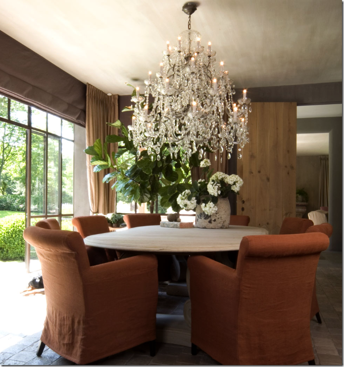
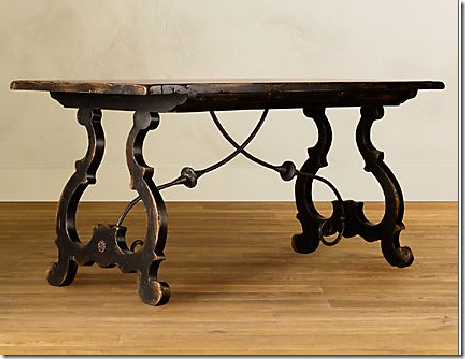
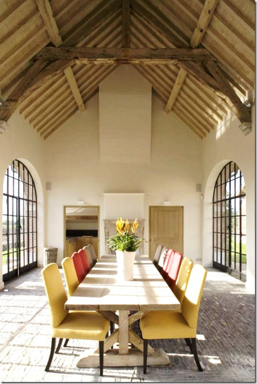
Two years ago House Beautiful declared “Belgian is the new Swedish” – how prescient that statement was. Today Belgian design IS the hottest thing with no signs of overkill or boredom setting in just yet. Why Belgium? Why Belgian design? Such a small country that few of us could immediately point to on a map, and even less of us have actually visited. The reason for Belgian design was explained to me by a designer from the Netherlands who said, that while the Netherlands is mostly a country of the middle class, Belgium has a very large poor population and a smaller, very extremely wealthy class of people. People who can afford to and who do restore the many country manors that dot their flat landscape. They fill up their newly renovated houses with beautiful antiques and art and they are courted by the eager designers waiting to guide them. Yet, guided by this small handful of extremely talented designers, they chose not to exactly fill up their houses but instead sparsely and deftly decorated them, letting each precious piece speak for itself instead of becoming lost in a sea of fauteuils and bergeres. This decade has indeed become the Belgian decade – the overscaled upholstery, the worm eaten, unstained woods, the linen textures, the large lanterns, the industrialized repurposed pieces - have all become a part of our lives without most even realizing that Belgian designers were behind it all. The look is perfect for the younger generation, couples who don’t want their parents furniture have hungrily sought out the spare designs. Weary antique lovers tired of frilly French and heavy English pieces are now flocking to Belgium to visit the warehouses and shops filled with things they have only seen before in pictures. Whether you like this design, whether you loathe it, it is here and it’s not going anywhere soon. In fact, Restoration Hardware has taken on Belgian design in a big way, betting the company’s future on a look so new, so foreign to the masses. They are predicting that America is firmly on Belgium’s side, as if this was a soccer match instead of interior design. Will Restoration Hardware be successful? I’m not sure, their pieces are stunningly gorgeous, yet pricey. Let’s wait and see what Target does. The ball is their court now.
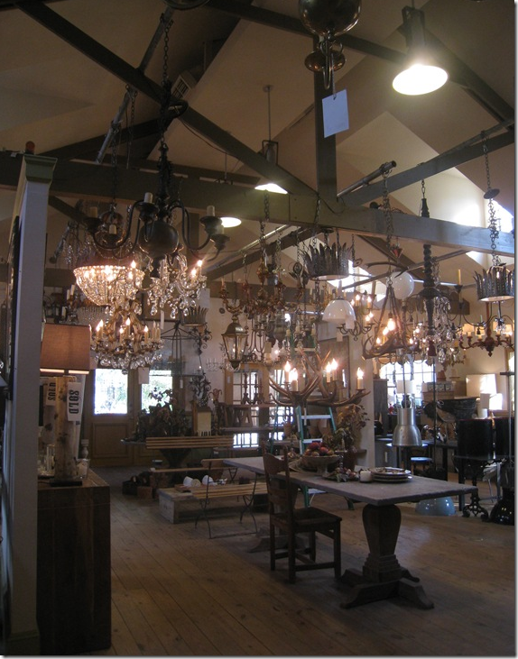 BROWN, Houston’s Belgian Design Mecca.
At one time, everything I knew about Belgium and its design and antiques, I learned from the woman who owns this shop, Jill Brown, a force to be reckoned with in Houston, 1st Dibs, and truly anywhere she goes. Jill, a charismatic trend-setter, had lived in Belgium and returned to Houston where she promptly opened an antique store stocked with wares she brought back from her adopted country. At that time – the legendary Axel Vervoordt had barely made a name for himself. So, for me and countless other Texans, BROWN was Belgian Design for years and years and still is and always will be. (See Jill’s wonderful house here.) Our exposure here in the south to Belgian Design was made of small steps that quickly added up.
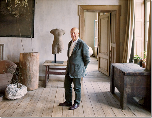
In the beginning, there was just Axel Vervoordt, the famous Belgian antiquarian first seen in Architectural Digest in 2002. It’s truly amazing how far he has come in 7 short years. Today, Vervoordt is credited, rightly or wrongly, with starting Belgian design. What is indisputable is that Vervoordt did introduce the world to this type of design. He authored several best selling books that helped spread the word about what was going on his country. He lured people to Belgium to tour his private castle and shop while they were there. His vision became everyone’s vision. No one has yet knocked him off his throne yet, though there are several contenders in Belgium. Here Vervoordt stands among the hallmarks of Belgian design – unstained woods, furniture made from organic materials, white walls, and sparse, monochromatic interiors.
And then in Houston during the mid 2000s, large, beautiful, and very expensive coffee table books began showing up mostly at the landscaping company, Thompson and Hanson. Their pages were full mostly of houses from Belgium. The publisher, Beta-Plus, out of Belgium, has been in the book business since 1995, but their sales have really taken off these past few years since the world has gone Belgian. Though hard to find, they truly are the definitive word on Belgian Design and a must-read to learn more about the style. Available here.
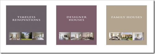 A small collection of the Beta-Plus books. I am trying to collect the entire group, I’m almost there!
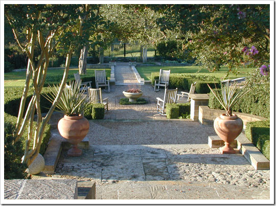
Sparse exteriors match Belgian interiors.
In Austin and in Houston, gardening went Euro, Zen, French, Belgian – call it whatever you like. But GARDENS in Austin and Thompson Hanson in Houston drastically changed the way many people thought about gardening. It certainly wasn’t all azaleas and magnolias anymore. Far, far from it. It was gardening with a light touch, a spare quality, where emphasis was on texture and shades of green, not colors and mounds of flowers. It was about gravel and boxwoods and biots filled with succulents.
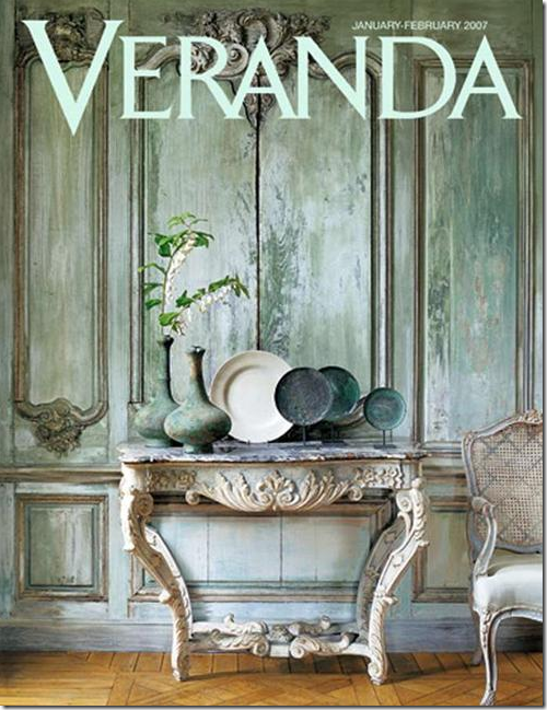
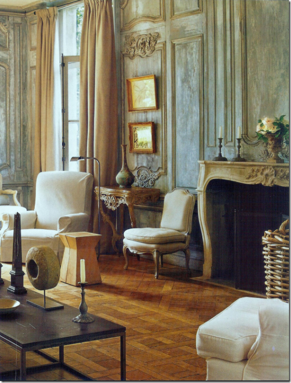
And, then there was THIS cover story – gee, was that really only two years ago? Seems so much longer! But look how gorgeous this is, the faux painted patina paneling, the ancient vessels. Was there a prettier cover ever?
It was enough to make us ALL get up and move to Belgium, wherever that was! When I was in college, my sister Melanie, my cousin Josette and I took a grand tour of Europe for a month – we went everywhere! Everywhere! But Belgium. Now, people see that country as a destination, with a layover in Paris.
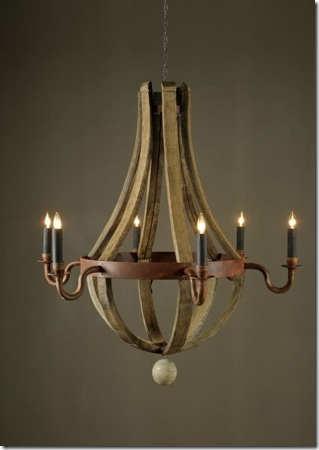
And then there was this light fixture – made from old wine barrels – it was copied everywhere.
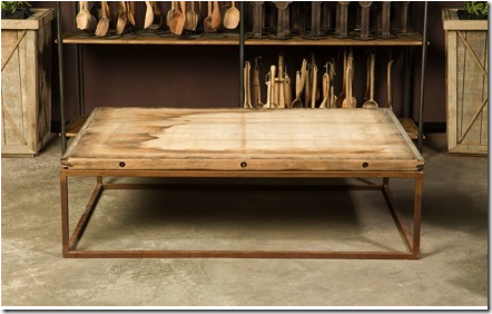
And there was this – the famous brick layer table. Thousands of these slabs bought at a quarry were turned into tables that today are still the hottest thing going. Until recently when Brooke from Velvet and Linen went to Atlanta and visited Bobo’s Intriguing Objects – I had no idea that the same person was behind both the wood barrel chandelier and the brick layer table. But BoBo and his Belgian partner designed both these objects which are the hallmark of Belgian design: organic and industrial at the same time.
Listen to Brooke’s most intriguing interview with the force behind Bobo’s Intriguing Objects here
In late 2007, House Beautiful showed this Belgian styled house in America declaring Belgian is the new Swedish. Lanterns, overscaled slipcovered furniture, light unfinished woods, white walls. This room is a pretty faithful reproduction except for the tufted contemporary chair – which is not Belgian at all.
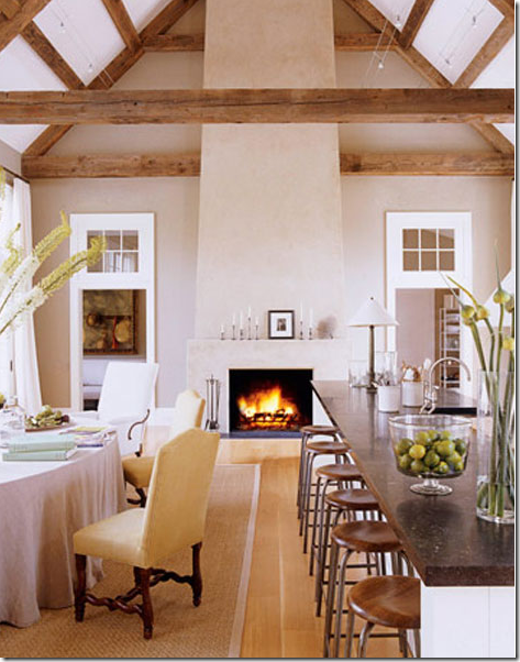
And Ina Garten’s new Hamptons barn was nothing by Belgian design for America. Everyone raved without even knowing it’s origins.
What exactly is true Belgian design?
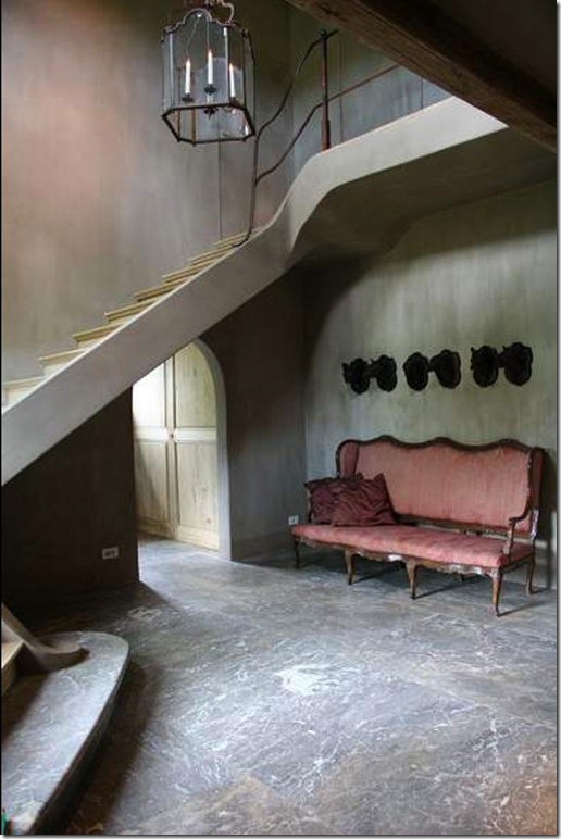
It’s big rooms that are sometimes almost empty. It’s huge lanterns and oversized pieces of furniture and spare, but large accessories.
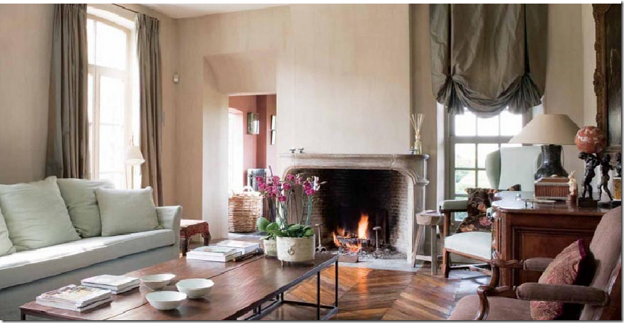
It’s long, lean sofas, sometimes with no cushions at all. It’s huge coffee tables with metal bases and simple wood tops.
Belgian Design is about a calm, quiet interior without much contrast. It’s sparse with one or two dressy pieces mixed in with wicker or something dragged inside from the outside.
Belgian design can be somber and dark with urns and vases and fabulous art work, but only one canvas per room, please.
It’s floors that aren’t stained or varnished, just limed and it’s wood paneling is also not stained. It’s about texture and shapes, it’s matte, not shiny.
It’s about attic rooms with ancient rafters and a mixture of French and Swedish antiques here and there. It’s not just about Belgium antiques at all.
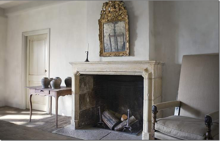
Belgian design is about monochromatic decorating in either grays or beiges or taupes. It’s about mirrors and worn terra cotta floors and kitchens filled with white dishes.
It’s about old houses in the country and in the city being restored for today with huge stone fireplaces and even older shutters.
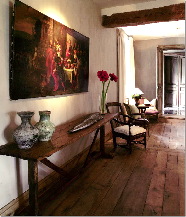 Belgian design is about wood – on the floors, the ceilings, the walls. It’s about worm eaten antique furniture. It’s about great art work and even greater architecture.
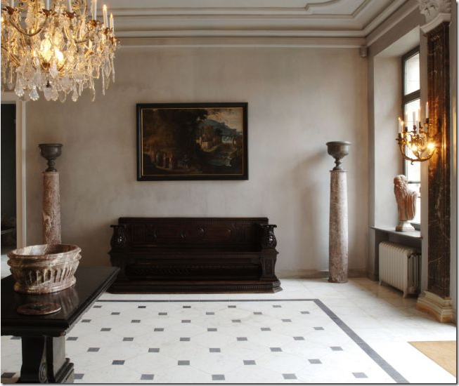
It’s about Belgian linen everywhere and light colored paneling. It’s about lamps made out of vases and fancy crystal chandeliers used in places you wouldn’t expect them.
It’s about reclaimed building materials being used on every surface – ancient marble floors and old flagstones from generations passed are sought out and prized.
It’s about mixing velvet with chipped, worm eaten wood and dressy mirrors mixed with lowly tables. It’s about a quiet, simple elegance that is accessible and down to earth – not fancy and untouchable.
Belgian design is about a mixture: of high and low, of dressy and casual, of organic and industrial, of unstained wood and white washed wood, it’s about overscaled slipcovered furniture and small dainty antiques. It’s about being quiet and subtle. It’s about being modest, not boastful.
Which brings to me today. Restoration Hardware, the store famous for reviving vintage games and old fashioned record players and deco fans has gone Belgian. An upscale hardware store that sells, well, hardware and paint along with slipcovered furniture and beautiful lamps has changed – in a huge way. Recently they partnered with the owners of Bobo and a few other select designers. This renowned group of artisans was given artistic license to create their products – some brought their own lines, some are exclusive for RH. The gamble is huge. The new RH is no longer inexpensive like the old days – this new inventory is pricey – but it has to be. It’s built to last a lifetime and it shows. These are gorgeous pieces, exquisitely executed, faithful and honest to their designers. RH started showing the next line slowly – a mirror here, a light fixture there. But now, their web site is full of all that is new and it’s breathtaking! It is the best in Belgian design for all of Americans to enjoy, along with the best of France and the other locales of inspiration. I was stunned at the beauty. I hope we are ready for this – to pay a little extra and get the best. It’s a huge business gamble especially in this climate of cutting back. RH is asking us to change our direction and turn down a new road. I’d hate for this company to go under now. It’s the best it’s ever been and their future is limitless, as long as people will be willing to pay the prices and buy the merchandise. I hope so. I’m dying to see what the next collection will bring!
Be sure to visit the web site and read about Bobo’s designs and all the other artisans who contributed to the new Restoration Hardware. Each person played an integral role in making this store the best there is right now.
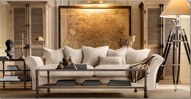
The Belgian camelback sofa is so beautiful! Slipcovered in linen, it’s a standout piece – the core of the collection. The industrial tables are Dutch. The oversized map of Paris is another stunner. And the lamp is gorgeous. I would buy every piece in this picture and be thrilled to have it! The wood cabinets are unstained just like you would find in Belgium. What styling, what advertising, how can one resist it?
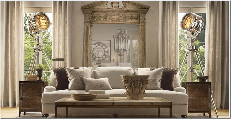
The English inspired sofa is slipcovered with hot-as-can-be feedbag pillows looking fabulous on it. Bobo’s brick layer table is here as are the two industrial side tables. The mirror was one of the first pieces they advertised – it’s beyond gorgeous. But the lamps are amazing – true works of art. RH is now carrying a line of breezy Belgian linen curtains that look perfect against all the woods and metals.
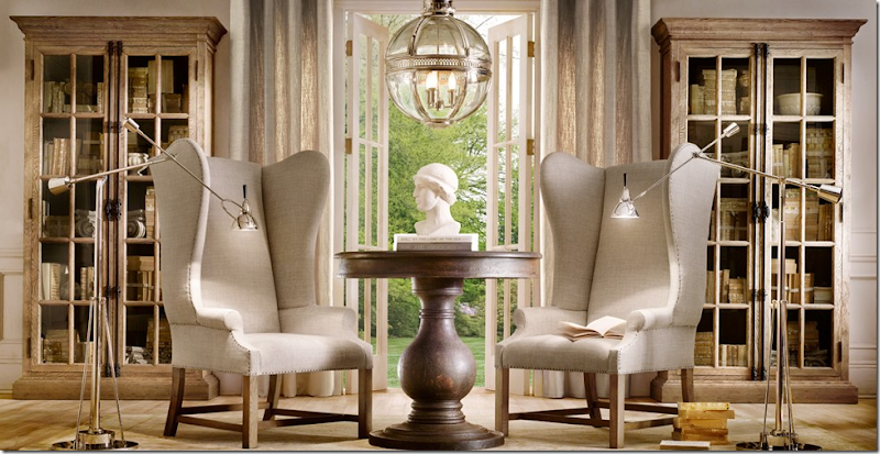
The photo styling for the catalogue is beautiful - the rooms look like they could be in a Belgian house in the country. The floors are light wood, unstained, the walls a light gray/taupe. And these 19th century styled French chairs are truly to die for! No cushions – which is so streamlined and hip. Just gorgeous. I would pair these with the Belgian sofa, stunning!! The chairs – a star in the line – were designed by Bobo. And notice the cabinets in the lightly stained wood.
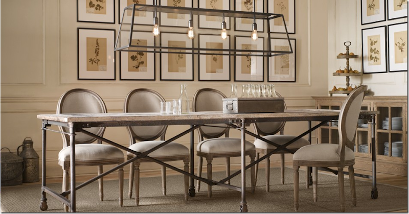
This dining room shows great chairs and a large unstained trestle table – made out of 100 year reclaimed wood from Britain. The gorgeous lanterns are repros made by Bobo. And in the back is a mirror clock. If you have the room for this huge table – wouldn’t it be wonderful? I would put it in a large galley kitchen or in a long breakfast room or a beach house.
Gorgeous repro French chairs (and these are so cheap too!) and I love this smaller version of the above table. BoBo’s famous wine barrel chandelier is shown, of course. The clock is a station replica but the mirror is the real focal point here. Belgian linen curtains.
The industrial styled Flatiron table – another wonderful casual table paired with medallion back Louis French chairs. The botanicals are great! But look at the light fixture !!!!!!!!!!!!!!!!!!! Gorgeous!!!!
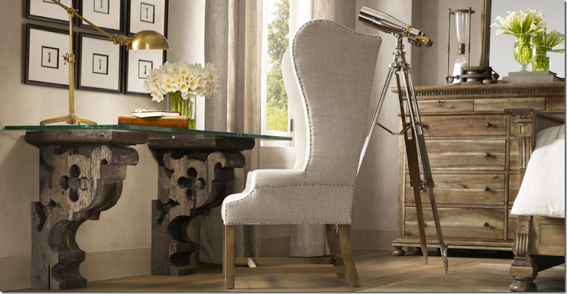
What a desk – from Restoration Hardware? It looks like something you would repurpose yourself! Again, this styling is superb.
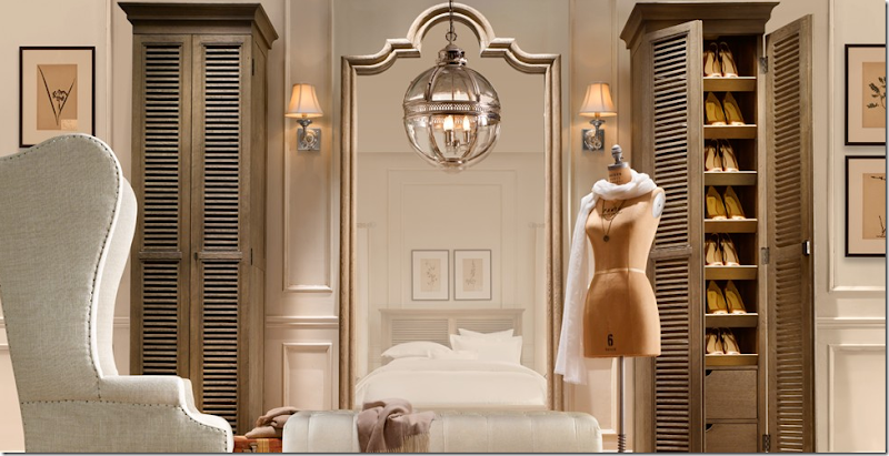
These unstained shoe cabinets double as towel cabinets. I think these chairs make anything wonderful! And the dressmaker form! So cute!!!
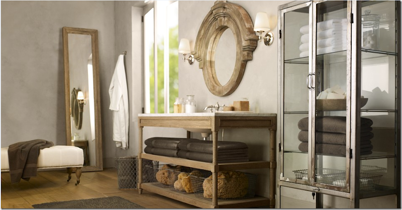
In large old Belgian houses (and all over Europe really,) bathrooms are carved out of whole rooms – so they are often quite spacious. Wouldn’t it be great to actually have all this space to really spread out? I love the medical cabinet and the Mansard mirror.
This Portuguese desk is one of my favorite new items. I would use it behind a sofa as a console table.
Restoration Hardware has brought Belgian Design to the masses. Will we accept it? Will we buy it? What stunning style it is – what looks better, where? I am just amazed by it all. Like I said, I hope Restoration Hardware makes it with this new direction. The items are not cheap and some are downright expensive compared to Pottery Barn and what we have come to expect from places like these. But, the quality, the style, the majesty of the furniture really sets it apart from the competition. Now, let’s see if Target jumps on the Belgian bandwagon and dilutes it of all it’s uniqueness. Probably the only way for Belgian design to be accepted by the masses is if Target does jump in the waters. Will it? Do we want that really? Does Restoration Hardware need the masses to accept Belgian Design?
