Wednesday, January 28, 2009
Belgian Design – Hot, Hot, Hot!
Belgian design is hot, hot, hot – swiftly taking the place of Swedish design in the trendiest style. Why Belgium, as opposed to say, The Netherlands? According to my friend, Ron Empel, owner of Empel Collections – a custom lighting company, and a native of Holland, the sleepy county of Belgium is home to two extreme classes, the ultra rich and the ultra poor – with very few in the middle. The Netherlands, by contrast, is a country of the middle – with few wealthy citizens and few poor. Where there is extreme wealth, there is usually good design to support the upper class’ desires and Belgium has been producing some very good design lately. It all started a few decades ago when the interior designer, antiquarian Axel Vervoordt, moved into a castle, made it his home and shop and invited the world to see his wares. Riding on Vervoodt’s coat tails, a group of architects and designers are now cashing in on the sudden wealth of publicity and now Belgian Design is THE look to have. The traditional Belgian style – not its contemporary style (which is plentiful) – is quiet and monotone. Few printed fabrics are used; instead plain linens and deep-hued velvets are favored. Houses in the country are renovated using antique elements – ancient stone floors, beams, marble staircases, and acres of limed wood - everywhere. The accessories are overscaled and very few – books are usually plentiful. Sofas are austere - large, long, and slipped – the opposite of our soft, down-filled cushions. Lighting fixtures play a big part in the design – oversized always, either lanterns or crystal chandeliers are used. Textures are a very large part of this style – rough, rustic woods and stone surfaces are played against smooth, shiny crystals and glass. To truly understand the Belgian look, the publishing house Beta-Plus is a great place to start.
Today, we’ll look at two houses in the Belgium countryside that typify the trendy Belgian look.
House #1
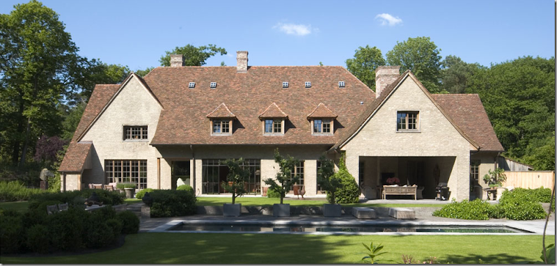
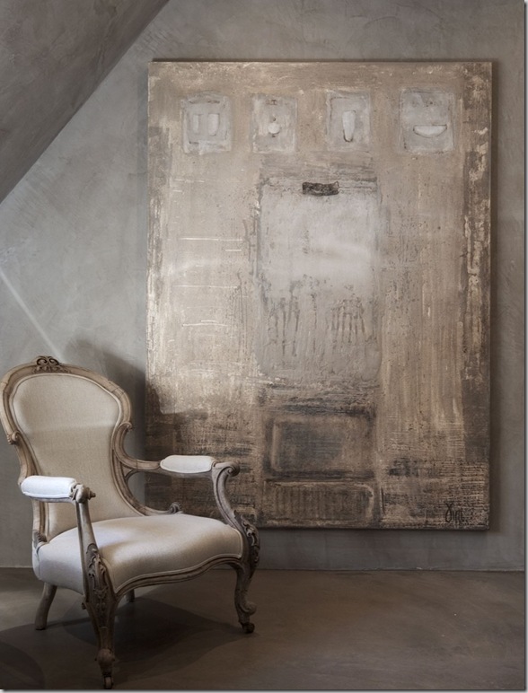
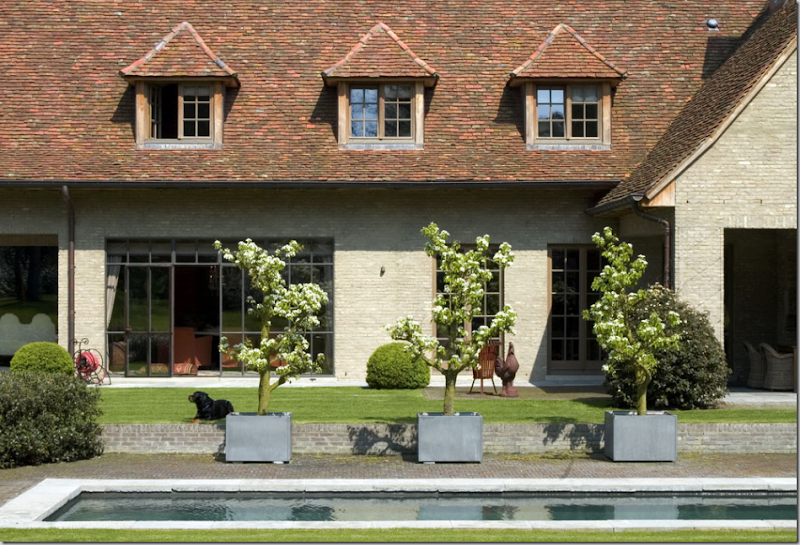
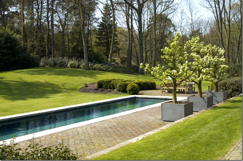
The first house – pictured above and here:
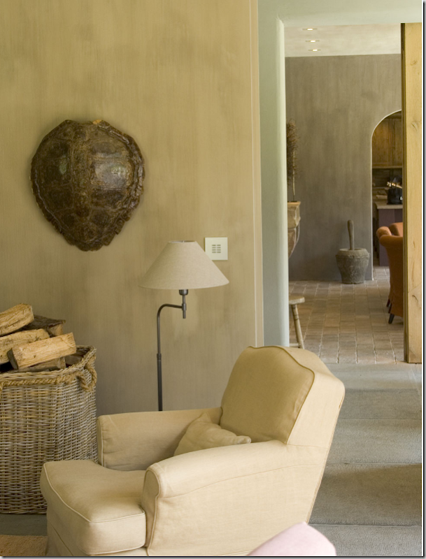
The living room – with an oversized arm chair, slipped in a neutral Belgian linen. The floors are large flags, antique - no doubt. The accessories are a lone tortoise shell. A basket of wood, much used, – becomes the objet d’art. The walls are fauxed in a light khaki tone, which picks up the linen color and the color of the freshly chopped wood.
The dining table is surrounded by a mass of arm chairs, slipped in persimmon linen. The iron framed windows open to the terrace, but can be covered against the cold wind by a lined, linen shade with curtains. The floors are antique tiles. The oversized chandelier becomes the focal point.
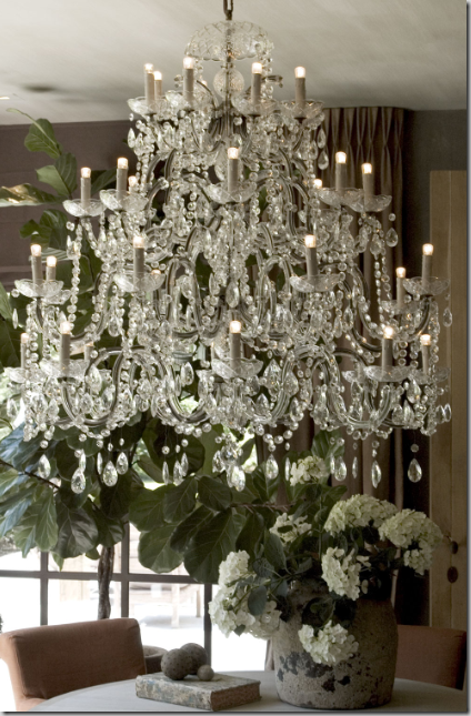
A close up of the chandelier. Notice the accessories on the table, so typical of Belgian design, plain concrete vases and balls, with an old, antique book.
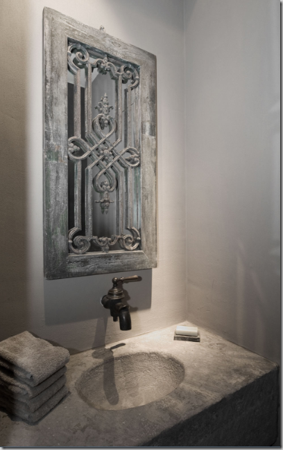
The powder room continues the austere Belgian design – a concrete sink with a single aged faucet. An antique window is made into a mirror. Everything is a neutral putty color, even the stacks of towels. As usual, the useful towels becomes a design element.
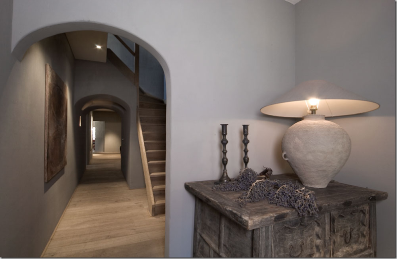
The stair hall. The floors are typically Belgian – unstained and unfinished planks, the color of the wood becomes the design element. The stairs are also unadorned. A trio of deep archways line the hall. The console is an ancient piece – rustic like the floors. The lamp, made out of a simple plain vase, continues the rough textured feel found throughout.
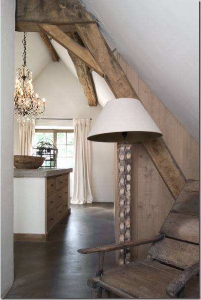
The bedroom on the top floor opens to the large bath and dressing area. The floor is smooth concrete. The walls are plaster and wood planks. Ancient beams hold up the roof.
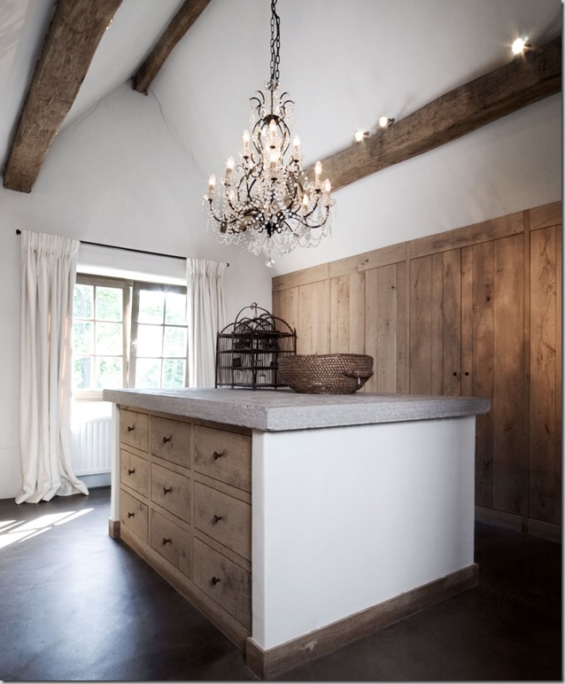
The dressing room, open to the bedroom, seen on the right behind the mirror. A large chandelier lights the area. The closets are behind the wooden plank doors. The center island dresser is topped with concrete, and a few baskets. Not sure who is standing there in a bathrobe!!!
The dressing room – the curtains are simple white Belgian linen. The drawers are rough, unstained wood – the same as the closet doors.
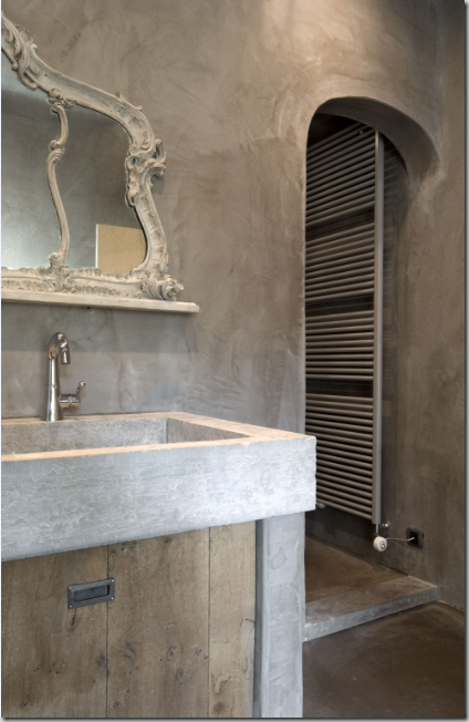
The master bath room with more concrete and wood cabinetry. A fancy antique mirror is juxtaposed against all the rough surfaces. The walls are a fauxed putty color, perhaps a plaster finish. The shower is through the arch.
In the master bath, a fancy, highly carved wood chair, sits next to an unexpected contemporary canvas. Belgian design is all about the mood, the quiet colors, the sparseness of the interiors against the vastness of the architecture, and the textures – the rough, rustic touches mixed with smooth, shiny crystals and glass.
The dining room is seen through the open iron windows.
The landscaping in early spring is as spare as the interiors are. The three blossoming trees in zinc pots are the main attraction. In the United States, we would put pots of blooming plants all around the pool!
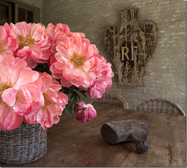
On the terrace, wicker chairs surround a wood table. A lone sign on the wall adds the only decoration, besides a wicker basket with a flowering plant.
House #2:
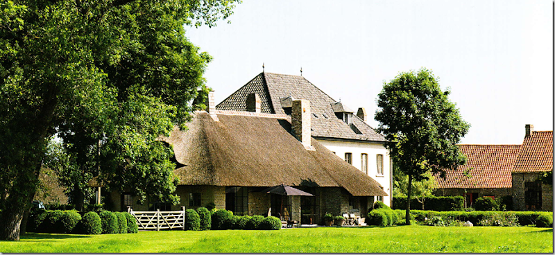
The second house is owned by a couple who are both antique dealers and interior designers, Alain and Brigitte Garnier. Their estate has several buildings that were renovated on the property, which at one time was a working farm. One building, is a low, thatched roof house.
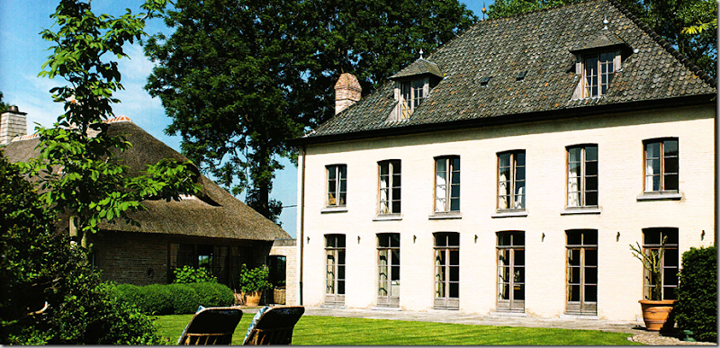
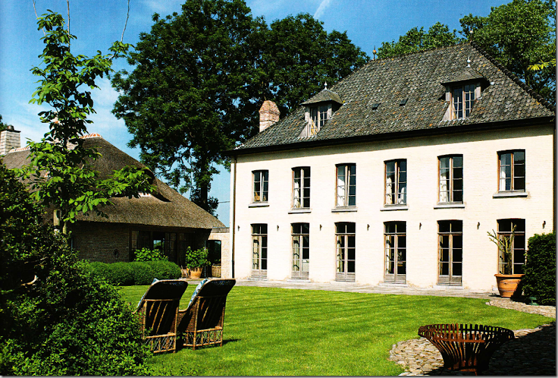
Connecting to the thatched roof smaller building is this three story white house. The kitchen and breakfast room are located in the smaller house, while the fancier living areas and bedrooms are in the white house.
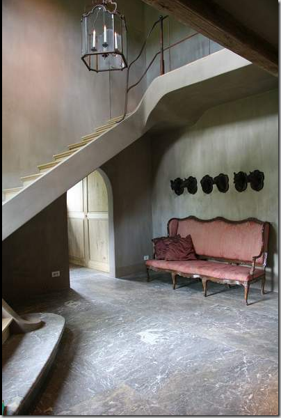
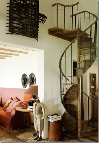
Inside, is a two story entry hall with a winding stone and wood staircase. A large lantern hangs over the typically Belgian sparse space. The walls are a cool putty color.
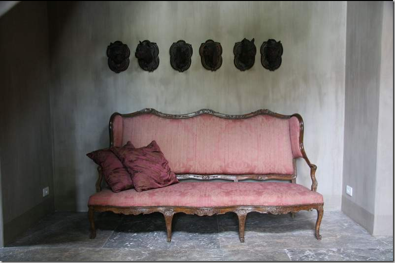
Under a row of carved wood animal heads, sits this antique settee. The floors are antique marble.
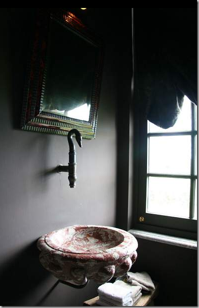
The powder room uses an antique marble bowl for a sink, with a single faucet in the shape of a swan’s head.
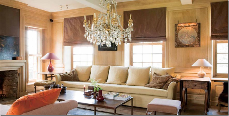
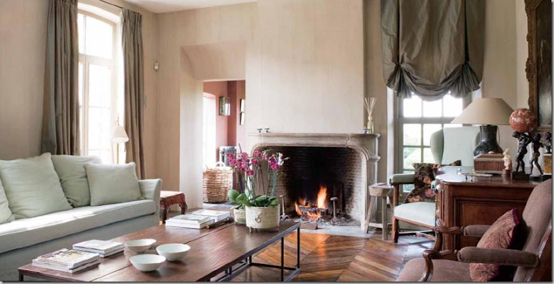
The family room has the typical Belgian sofa, slipped in linen – long and plain. The coffee table has the industrial look that Belgian design is famous for: wood and iron. The Garniers designed this table and currently sell it, along with other versions and sizes. The walls are plain limed wood. As always, the lighting fixture plays an important role in the design. Through the opening is the living and dining room.
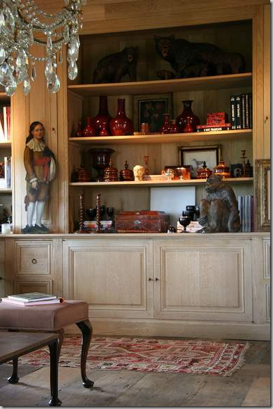
The antique dealer owners have many collections – here they display a large collection oxblood vases.
The family room, from the other side, with it’s long, slipped Belgian sofa and crystal chandelier.
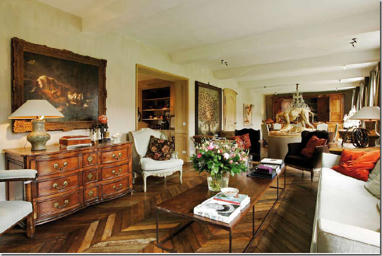
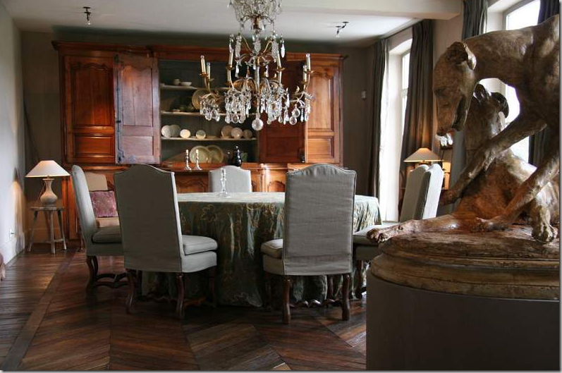
Connecting to the family room is the combination living room and dining room – which runs the length of the white house. The two areas are separated by a large statue of dogs on a pedestal. Since the owners are antique dealers, this home has a more cluttered look than typical. The floors are aged wood planks in a herringbone pattern.
The living room, facing the sofa. Through the doorway is the connection to the thatched roof house, where the kitchen and breakfast rooms are.
The dining room has a large, round skirted table surrounded by tall Os De Mouton chairs, slipped in Belgian linen. An antique chandelier hangs low over the table. A large French armoire runs the width of the wall. In the foreground is the dog sculpture, dividing the living and dining areas.
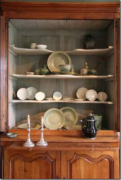
A close up of the armoire which holds a collection of antique Celadon pottery.
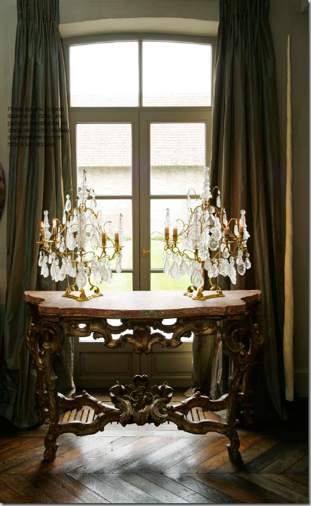
Standing between the living and dining areas is this gorgeous marble topped console with two crystal candelabras. Always the texture, the juxtapositions of smooth and rough, fancy and rustic.
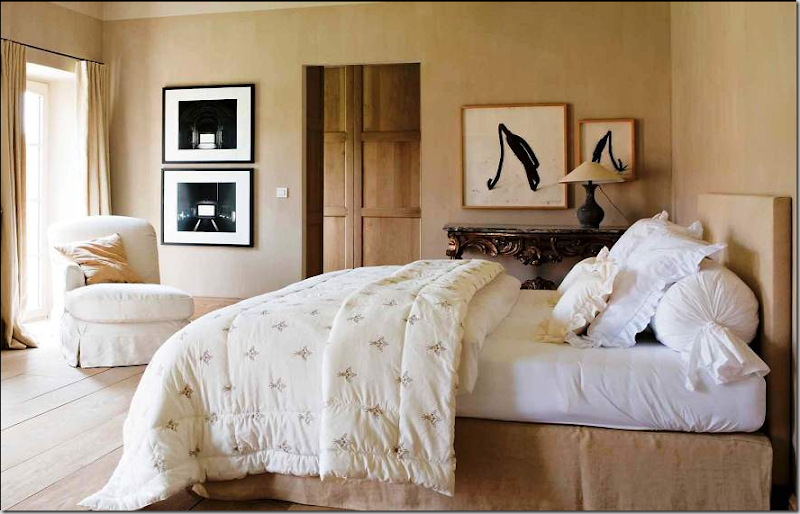
Upstairs, a bedroom with simple limed wood planks and wood doors. Modern art plays against all the antiques and the age of architecture, itself.
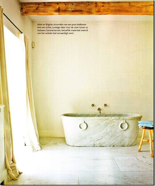
Antique marble floor and tub in a large bathroom. Unadorned and sparse – Belgian style!
Another bedroom, a rare dark room, with white linen that pops against the walls.
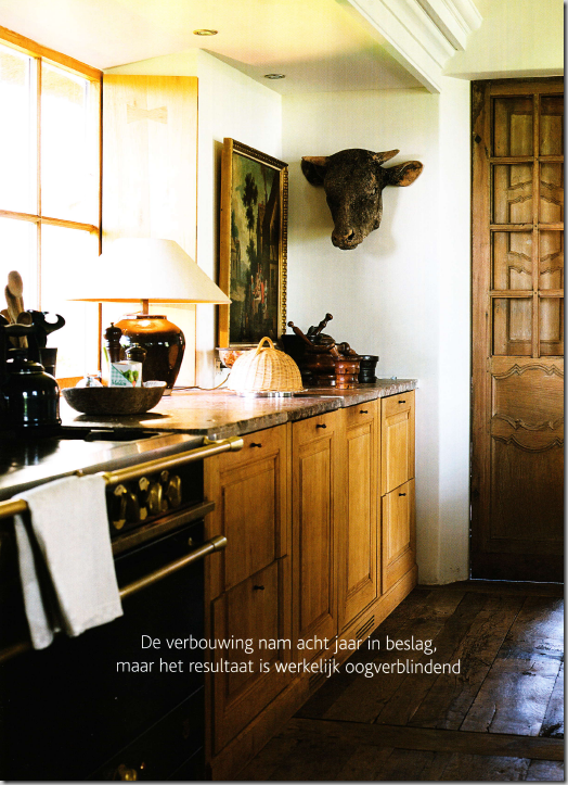
The kitchen and breakfast room are located in the small thatched roof house. Notice the beautiful wooden door and attached shutter. The kitchen is accessorized as a living area with fine art work and lamps.
The black range with it’s black tiled backsplash. Next to the range, the sink and countertops are marble.
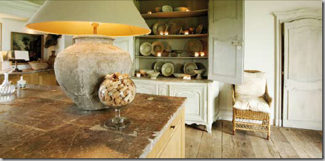
Across from the island, a large green armoire holds more celadon pottery. Notice the charming door next to the wicker chair.
In the kitchen, an old spiral staircase leads to the upstairs loft area. The breakfast room is through the opening.
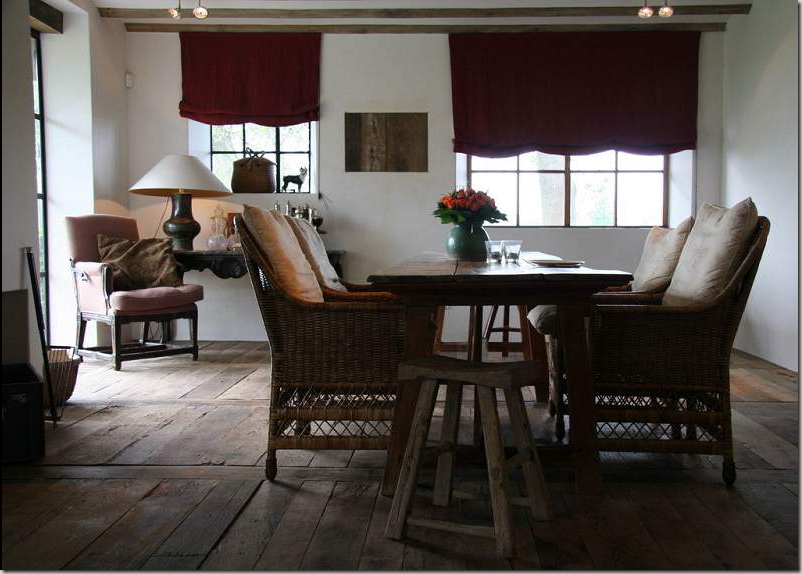
The breakfast room, here with a wooden table surrounded by new wicker chairs with toile cushions. The Garniers sell this chair. In fact, they manufacture all the upholstery pieces, lamps, and new tables seen in the house. I suspect everything is actually for sale!
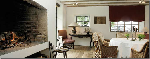
Another view of the breakfast room, styled differently with a round table. The large, original fireplace is elevated, the wood is stored below.
The two houses. Outside the French doors across the front is the large living room – dining room combination. The wicker lounge chairs are sold by the Garniers. Be sure to visit their web site to see all their fabulous merchandise!
And in the United States, visit Brown, located in Houston Texas and on 1st Dibs for a collection of unique items, antique and new from Belgium. Brown specializes in lighting fixtures and industrial design, along with Belgian design.
Monday, January 26, 2009
Carlos De Spinola Photograhy
Carlos de Spinola Photography
Technorati Tags: Carlos De Spinola, Photography, Photos, Images, Art, Wildlife
Saturday, January 24, 2009
Michael Smith and a Trashcan Makes The News
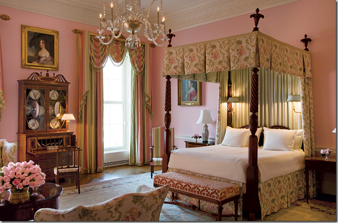
The White House: The Queen’s Bedroom under the Bush Administration. I’ll wager this bedroom is where Michelle’s mother will live.
Note: Picture updated.
News of Michael S. Smith is everywhere these days. And rightly so, being named by the Obamas to decorate the private living quarters of the White House, is big, big news. The appointment was first leaked by blogger The Peak of Chic, causing much excitement throughout the design blogosphere. The official news came via domino magazine’s web site - how fitting for what is called the first high-tech presidency. Who knows, maybe Obama downloads domino’s web site on his famous blackberry? I can’t remember another White House designer creating such a stir. Truthfully, I still don’t know which interior designer the Bushes used. The choice of Smith was a surprise to me, a total surprise – though in hindsight he is a perfect fit. His love and knowledge of antiques is legendary as is the way he puts together his interiors, warm, cozy and inviting despite the high price tag of the furnishings. I had thought the Obamas would choose Sheila Bridges, an Afro-American designer from NYC. I couldn’t have been more off-base. As the days go by, the anticipation grows, and those first glimpses of Smith’s work for the Obamas will be highly sought after. Unfortunately, the news this week concerning Smith was actually not all that great - in fact, it was terrible. Read on.
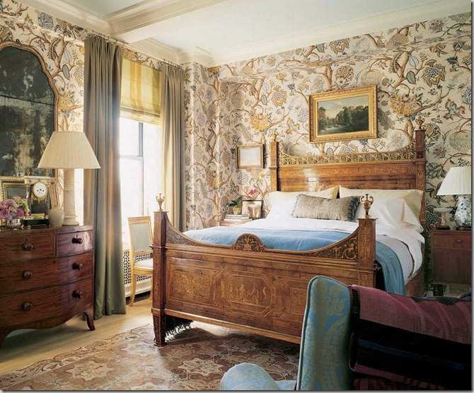
This decor by Smith would make a wonderful guest room in the White House. Smith’s style – mixing grand and not so grand antiques in warm and cozy interiors is exactly why the Obama’s hired him.
Californian interior designer to the stars, Michael S. Smith, couldn’t afford the huge amount of press he’s received in the past few days. Too bad it’s all been bad press. After a career unblemished by any hint of misconduct, this week has been a public relations disaster for the genial designer. Smith, riding high after being named the Obama’s interior decorator is now embroiled in the Wall Street scandal and the story couldn’t come at a worse time for him, the Obama’s and for The White House.
Michael Smith and Wall Street? What? It goes something like this: The disgraced CEO of Merrill Lynch, John Thain, was fired this week (or resigned as he puts it) by the new owners of the once reputable stock firm. Apparently, Thain was unceremoniously dumped because he hoodwinked Bank of America, the company that bailed out Merrill Lynch: the merger was finalized after just two days of due diligence. Bank of America execs have been less than pleased with Thain ever since the magnitude of Merrill Lynch’s losses became apparent – something Thain apparently tried to hide. Hired just a few years ago to bring Merrill Lynch back to profitability, Thain tried to salvage the firm, firing thousands and cutting expenses for everyone except himself. While his firm was suffering unprecedented losses, he hired Michael Smith to decorate his office at a total cost of $1,220,000. The Manhattan office includes Thain’s conference room and private dining room. Smith’s invoice was splashed all over the news this week – in detail, leaked no doubt by a disgusted Bank of America official. I can only imagine the sheer horror Smith must have felt having his exorbitant tab laid bare for everyone to leer at. Business blogs have had a field day with Smith’s bill – and Thain will forever be remembered for his parchment covered trash can, for which Merrill Lynch paid Smith a princely $1,405! The maligned trash can is surely destined to become the symbol of Wall Street greed, 21st century style.
What is especially galling about the story is that while Thain was spending millions on redecorating his office, he insisted his employees curtail their own expenses on travel, entertainment and cars. At the same time, he paid his private driver an $85,000 salary with a bonus of $18,000 and $128,000 in over-time pay. It’s interesting to compare budgets: the Obamas hired Smith to design their White House living quarters for a paltry $100,000. While everyone realized this sum was probably not realistic – contrast this with Thain’s $1,220,000 budget. Even more telling, Thain paid over $100,000 for just three chairs! How in the world is Smith going to work with the Obamas’ $100,000 limit? In Elle Decor’s Margaret Russell’s interview with Matt Lauer about the White House commission, she brags that Smith is known for shopping at bargain places, like Target and Anthropologie. Really? The only thing I’ve ever seen Smith do that was budget friendly was to purchase these bedspreads, below, at Urban Outfitters, which he used for wall coverings, curtains and upholstery. The cost of labor to install all the Indian bedspreads surely catapulted this budget into the stratosphere. So much for cost cutting.
Smith decorated this guest room using bedspreads from Urban Outfitters.
Smith’s public relations fiasco puts a damper on the jubilation that greeted the news of his White House commission. It will be hard for the Obamas to justify hiring Smith while he is playing such a public role in the current excesses of Wall Street. The leaked statement highlights the greed that these top CEO’s have and the cash it takes to fuel their lifestyles. Thain’s personal life takes lots and lots of money to run and we have all paid for it. While untold millions of people are facing financial doom, the ones responsible for the financial disaster live lives that Kings would envy. As Merrill Lynch faced collapse, the United States government, using tax payers money stepped in to stop the bleeding – averting their inevitable bankruptcy. Using those tax payer funds, Thain made sure his buddies got their share – an estimated 3 to 4 billion dollars in bonuses. Thain himself, perhaps in a rare moment of guilt, declined to take his promised $100 million bonus. Nice of him, huh?
Thain and his wife Carmen live in a Park Avenue duplex worth $27.5 million. Additionally, they own a country home that straddles two different towns – Harrison and Rye, New York. His property taxes are over $150,000 a year to those two towns. Purchased in 1995 for $3.7 million, the country home is now worth over $10 million and is on 10 acres of pricey real estate. Included in the estate are beehives, a river, a stocked lake, a clay tennis court, several horse paddocks, and two swimming pools - along with a barn larger than neighboring houses. The house is 97 years old and has 14 bedrooms and an underground heated garage. Smith decorated both Thain houses, natch.
Though now out of a job, Thain will be busy in the coming months preparing a defense. New York attorney general Andrew Cuomo is investigating the bonuses that Thain paid his cronies last December – just before the deal with Bank of America closed. Bonuses at Merrill Lynch are normally paid in either January or February. The timing of those ill-gotten bonuses, along with his decorating bills have made Thain public enemy #1.
Smith’s invoices, obtained first by CNBC news, show that Smith was hired for $837,000. I have found two different lists of items ordered for the office, with some pieces appearing to either overlap or are misnamed. Most prices are eye-popping. The area rug for Thain’s conference room came in at $87,784. Compare this with the $61,000 rug Laura Bush designed for her hubby’s Oval Office. Obama is said to love that rug and will continue to use it – at least until he orders his own!
The Oval Office rug that Laura Bush designed – Obama is said to be keeping it, for now.
Other items ordered by Smith for Thain’s office are listed below. I went to 1st Dibs to see how Smith’s prices compared to those on 1st Dibs and what the furniture might look like. Most prices on Thain’s invoice are at the top of heap, unbelievably high, some items I had to really search to find a comparably priced item. It makes one wonder if all of Smith’s clients pay such prices. Thain’s list is below. Enjoy!
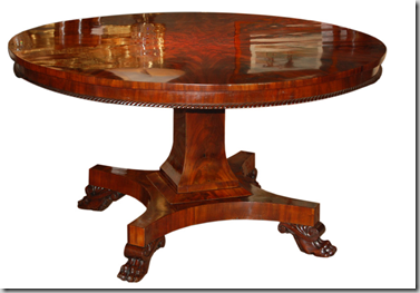
1. Mahogany Pedestal Table - $25,713
On 1st Dibs, I found this Regency table from 1820 for $18,900.
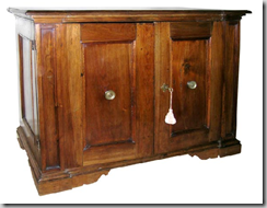
2. 19th Century Credenza in Thain’s office - $68,179, this must be a very nice credenza!
1st Dibs had nothing in this price range for credenzas, the closest I could find is a 16th century credenza for $23,800.
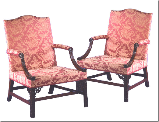
3. Pair of Guest Chairs $87,784 – seems quite extravagant for an office.
Coming in higher on 1st Dibs are these George III Library Chairs, 1770, pair for $110,000.
4. George IV Chair, this has also been reported as a desk - $18,468
1st Dibs has this wonderful George IV chair, although it still needs fabric! $4350.
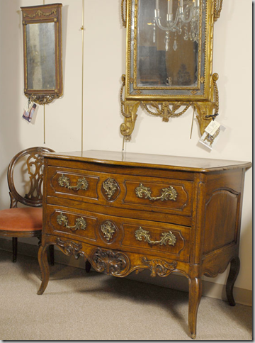
5. Commode on Legs at $35,115 – this item has caused much amusement as people think it’s a toilet!
On 1st Dibs I found this beautiful Louis XV Period Walnut Commode Raised on Cabriole Legs, c. 1760, France for $42,000.
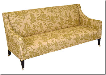
6. Sofa for $15,000
At George Smith, I found this sofa for just $10,000. Thain’s sofa probably came from Smith’s own company.
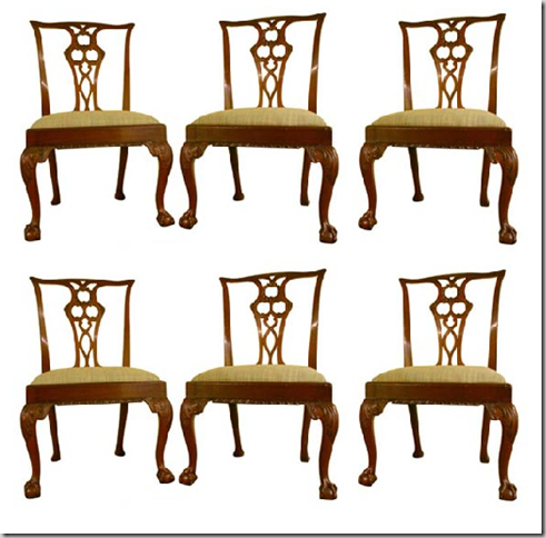
7. Six Chairs for his private dining room - $37,000 – rather pricey
1st Dibs had this set of six, Chippendale Style chairs, from 1770 for $16,500 – a steal!
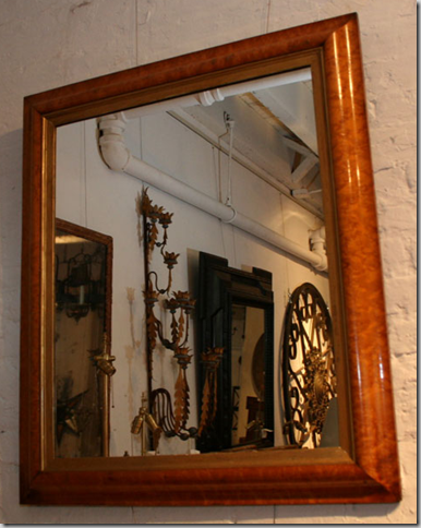
8. Mirror for the dining room - $5,000 – this is actually reasonable for an antique.
I found this on 1st Dibs, French 19th century Bird’s eye maple mirror, $5,000.
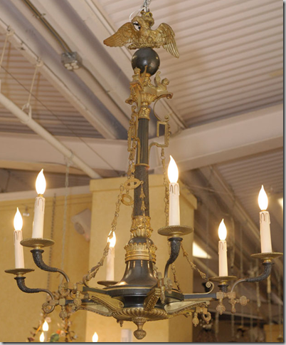
9. Chandelier for the dining room - $13,000 – again, somewhat reasonable for an antique.
1st Dibs had this beautiful chandelier, just slightly higher priced than Thain’s.
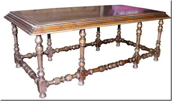
10. Custom Coffee Table for $16,000 – seems pricey. Probably came from Smith’s own company.
1st Dibs has this antique coffee table with slate top, late 19th century for just $9,750.’
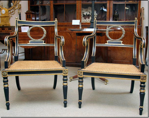
11. Regency Chairs - $24,000.
1st Dibs has this almost perfect match, a pair of parcel gilt Regency period armchairs from England, Circa 1810 for $28,500.
Other items for Thain’s office includes:
6 Wall Sconces $2,741 – reasonable – again, wonder if these are from Smith’s line for Visual Comfort?
Rewiring of sconces $3,000 – reasonable.
Parchment Waste Can $1,405 – I can’t even comment on this.
Roman Shade Fabric $10,967.
Roman Shades $7,315 – reasonable for high end design.
Pendant Light Furniture $19,751 – not sure what this is???? Anyone know?
4 Pairs of Curtains - $28,091.
40 yards of fabric for wall panels, $5,000 – actually not totally outrageous, but this is retail pricing. Wonder if he used his own line of fabric?
Thain personally signed off on $30,000 in expenses that Smith incurred doing the job, in addition to the $800,000, presumably room and board while in NYC, I suppose.
I’ve added up all the items, plus Smith’s fee and I come out over the $1,220.00. I’m not sure if Smith’s $800,000 fee includes these purchases or not. Also – it’s possible these prices are retail and Thain was offered a discount. It’s possible!!!! These figures were originally made public on both CNBC and The Huffington Post.
A Manhattan high-rise designed by Smith – this could possibly be what the Thain’s apartment looks like.
Wait, the news blitz on Smith is not over. As if the coverage of Smith’s unfortunate association with Merrill Lynch wasn’t enough – there was even more press for the beleaguered Smith. An antique bed he purchased for the Obama White House showed up in the newspaper, leaked by the owner of the shop from where it was purchased. The Providence Journal broke the story of the now sure-to-be famous bed. “The bed is an antique tall post adapted to king size from bedposts fashioned from tiger maple in the early 19th century” reads the press release, but exactly who released the press release was not released. Oy! The bed was purchased at Leonards New England. Leonards, a 75 year old landmark, has two locations, one in Seekonk, Massachusetts and another in Westport. Leonards’ stock is pure Michael Smith and I can surely see why he shops there. The manager confirmed that Smith is a customer, as is Steven Spielberg (a Smith client), Julia Roberts and Bill Cosby. I’m surprised Oprah is not a client, she loves Americana.
Concerning THE bed, the owners, the Jenkins, father and son, AND the store manager all had different tales to tell. One says they delivered the bed to a warehouse in Maryland that Smith is using to store Obama goodies. The delivery men couldn’t see what else was in the warehouse that is headed for the White House because it was all tightly covered up. Another story says Leonards delivered the bed directly to the back door of the White House. And still another story confirms the bed is tagged for the master bedroom. The elder Jenkins said the phone call from Smith confirming the White House sale was the call of a lifetime. I’ll bet! But still, it leaves me wondering what the privacy-loving Smith thinks about all this publicity surrounding the bed. After all, Margaret Russell told Matt Lauer that Smith hasn’t yet given any interviews about the White House commission and “he won’t.” Maybe someone should tell that to the Jenkins, but who can blame them for their excitement?
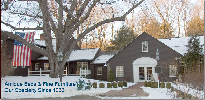
Leonards, only in New England are shops this picturesque! I wouldn’t mind moving in here!
Is this photo shopped? Apparently the bed was delivered the night before the Inauguration, but I didn’t think there was snow on the ground then.
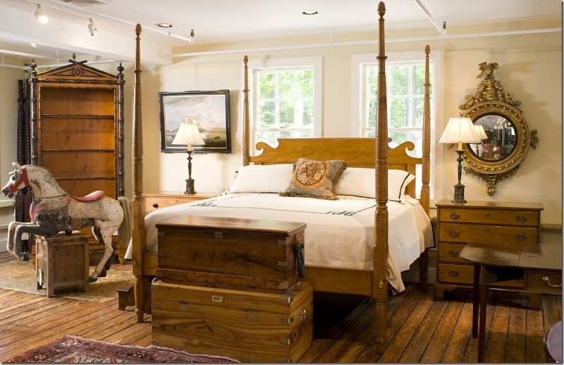
The actual tiger maple bed the Obama’s bought from Leonards. No surprise here – how many times have we seen Smith use beds similar to this? I think the girls would love that carousal horse for their rooms!
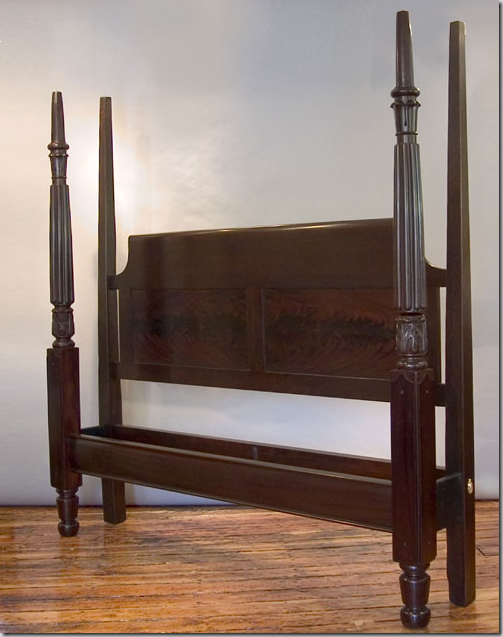
Classic English Tall Post bed in Mahogany found on Leonards’ web site – I can see Smith buying this bed for another White House bedroom– it’s gorgeous.
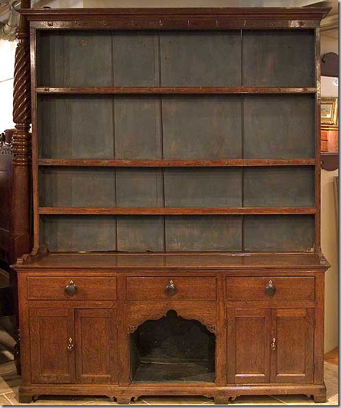
On Leonards web site - 1880 English Oak – dog kennel Dresser – this would be a great piece for the playroom or private dining room, especially with the cubby for the new Obama puppy!
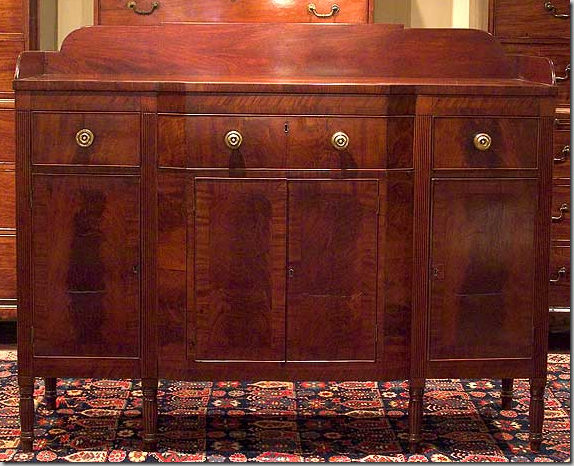
How American does it get? This Federal New York sideboard from the 1840’s from Leonards would be a nice piece in the White House private quarters.
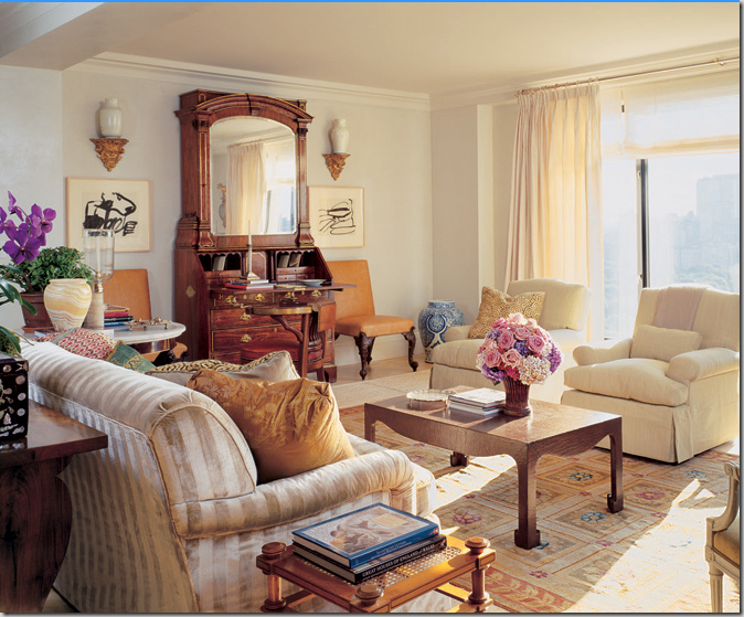
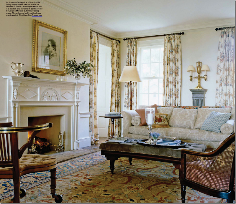
This estate in upstate New York, designed by Michael Smith and featured in November’s Elle Decor, reminds me of the type of furniture that Leonards carries. I wonder if some of this was purchased there? I hope Smith incorporates elements from this room in the White House, such as print curtains, cane furniture, tufted ottomans, and comfortable seating.
More from the New York house. Wouldn’t this be a wonderful look for the Obamas’ private dining room?
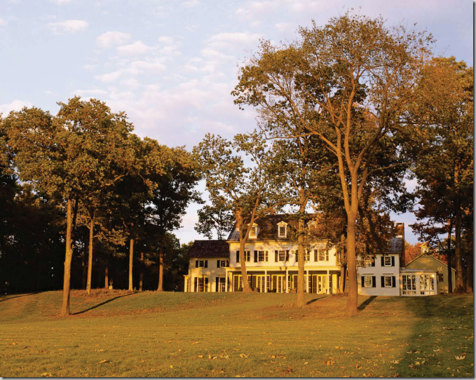
I am so curious as to whether the Obama’s will have a canopy over their new tiger maple bed. Canopies are wonderful in large rooms, they become a room within a room and cozy up an oversized space. I wonder if the First Lady perused this particular layout and felt a connection with this house and The White House?
After all, the house IS white and three stories!!
Hopefully, the press on Michael Smith will die down this coming week. Along with most of the design blogosphere, I can’t wait to see what Smith does to America’s house. I can’t remember another White House makeover – since Jackie Kennedy’s - which sparked so much interest. Most likely, Smith isn’t too bothered by all the negative press as he is frantically finishing up his work for the Obamas. And hopefully, there won’t be any more bad news, as long as he isn’t the interior designer for the Taliban!
